Lightricks Design System team was formed as an effort to establish a coherent and consistent source of components, styles, and patterns to make it seamless and more efficient for Lightricks' Product Designers to design consistent experiences across all Lightricks apps, and bridge the gap between designers and developers with a common shared language.
Mobile Components
Designed, prototyped, and defined 26+ platform-agnostic mobile components.
Web Components
Designed, prototyped, and implemented 30+ desktop components in React & SASS.
Design Language
Developed scalable, flexible, and themable color framework.
Component Documentation
Created a documentation structure and documented all components.
Mobile & Web App
Designed a mobile catalog app with a list of styles and tweakable components.
Senior Product Designer
2021-2022
Helped establish basic foundation of the design system. Proposed new workflows. Designed, prototyped and tested components - both on mobile and desktop. Created documentation and design resources. Worked closely with the tech infrastructure team on design system implementation. Mentored and taught others about best design practices, platform-specific conventions, Figma how-to's. Presented changes, and additions to the design system while gathering and integrating feedback from all teams - supporting 20+ designers, 100+ developers, and 9+ apps across 3 platforms. Worked closely with the Facetune team to redesign the Facetune app (used by 200M+ people).
Design
End-to-End Product Design, UI Design, Interaction Design, High-Fidelity Prototyping, Design System Design
Misc
Documentation, UI Development
Tools
Figma, Origami Studio, Xcode
Platforms
iOS, Android, Web
Design System
Empowering 20+ designers and 100+ developers to be more consistent, efficient, and ship better experience across 9+ apps and 3 platforms by creating a cross-organizational design system.
Situation
Audience
Due to the fact that the audience of this project was twofold and included both Lightricks employees (most notably Product Designers and Developers), as well as the end-users of Lightricks apps, our main goal was to help deliver great experiences to our customers across multiple products and platforms while creating a coherent and consistent system that was thought-through and intuitive for both Designers and Developers.

The Problem
Refining existing product features or designing new ones was inefficient and chaotic, leading to subpar inconsistent experiences and unnecessary frustration and misunderstanding between designers and developers.
Beginning with the design process - when a designer started working on improvements to an existing feature, they would - in most of the cases - have to take screenshots of an app in its current state, or hunt for a design file of that specific feature with UI elements being standalone and in many cases not a source of truth to what was implemented in the product. Similarly, when starting to work on a new feature, the designer had to gather existing app UI elements, and find relevant colors and font styles to use in their new designs.
Once a UI flow was designed, refined, and approved, the Designer would begin annotation of the UI to not only to provide the Developers with the logic and behavior, but to create annotated dimensional guides for sizes and spacing of all the UI elements on each screen, as well as add all the descriptions of fonts and colors used - specified in fixed hex color values, font weights and sizes, resulting in an incredibly inefficient handover. In many cases, most of the UI would be implemented from scratch even if similar UI was already in place in the app or used across other apps in the organization.
During this process, there would be a lack of understanding between Designers and Developers due to lack of common language and processes across teams leading to frustration and endless back and forth. Some features were built once and then replicated across multiple apps without having a single source of truth. If any improvements or fixes were made in once app, other teams would not benefit from the changes. This led to scaling challenges, inefficiencies, and a lot of time spent on additional training when designers and developers would move between different teams across the organization to find out that different processes were in place. Cross-platform inconsistencies were the norm.
In a nutshell, the most common problems were lack of reusability of common UI elements, colors, and fonts; no centralized knowledge base and nonexistent single source of truth.
Approach
As a Senior Product Designer on a team of 2, I was given the responsibility to explore existing painpoints of both designers and engineers, gather common patterns across all Lightricks apps, help establish basic foundation of the design system - focusing on creating a dynamic theming system consistent across all apps while being flexible to give enough of freedom to all; propose new workflows, design, prototype and test all components, create documentation and design resources, while working with the tech infrastructure team on design system implementation, mentor and teach others about best design practices, platform-specific conventions, Figma how-to's, and last but not least keep everyone updated on any changes, and additions to the design system while gathering and integrating feedback from all teams - supporting 20+ designers, 100+ developers, and 9+ apps across 3 platforms.
The Process
My process would start with research where I would talk to product teams to understand their needs and painpoints, as well as audit existing components. After getting enough of context, I would design components in Figma, and prototype them in Origami Studio - thinking through interaction design and adding little details with transitions and haptic feedback. The resulting design and prototypes would be tested to make sure they solve specific needs and pinpoints and would work in all existing apps.
In addition, I would present the results to teams and gather feedback to make further improvements. Once everyone involved was happy, I would go to organize and clean up designs in Figma, thoroughly document the component's purpose, behavior, properties, and usage guidelines, as well as create a thorough annotated blueprint for engineers.
When a component was prioritized by the tech infrastructure team to be developed, we would have a kick off meeting to present the component and its behavior, discussing all the details and edge cases to make sure we are on the same page. The naming convention of components and their properties would be shared between both engineers and developers so it was critical to come to consensus while considering technical capabilities and constraints as well as the capabilities and constraints of the Figma design tool.
If there were any issues or concerns, I would go back to the drawing board to further refine each component to make sure we deliver the best experience to all. When a component was built up to everyone's high standards, approved and published, I would then update everyone. If there were requests for improvements, changes and additions to existing components, they were prioritized and implemented while keeping everyone updated.
I would also support individual designers - not only when they were converting their existing app designs to the Lightricks Design System - but also providing them with advice on the best design practices, discussing the intended use of specific styles and components, and gather any issues and ideas for improvement. The Lightricks Design System was made to support the product teams, not to be authoritarian and constraining, so the end product design was up to each team and not the Design System Team.
Outcome
Mobile Components
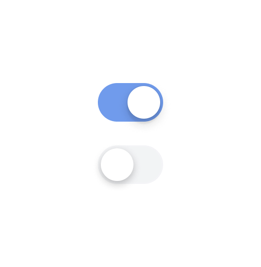
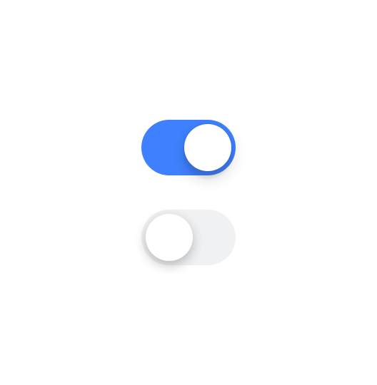
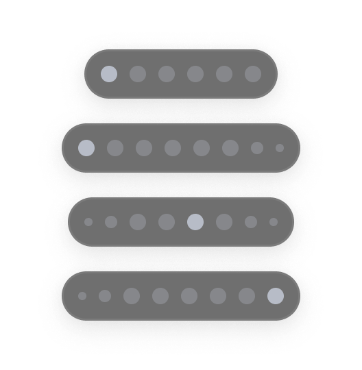
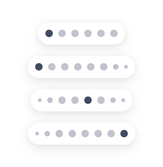
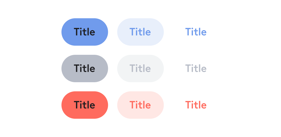
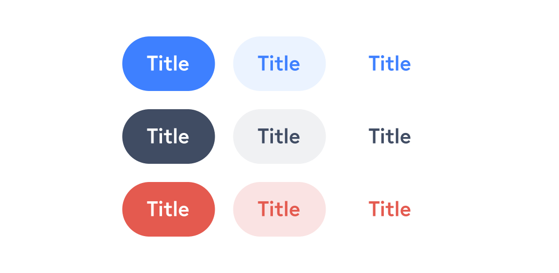
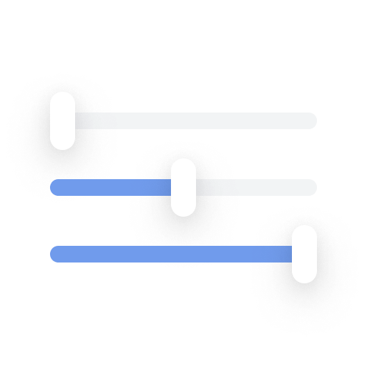
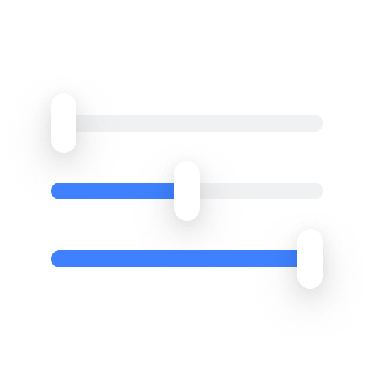
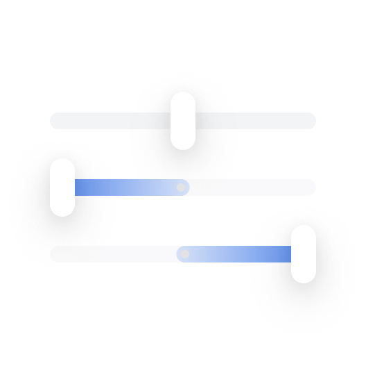
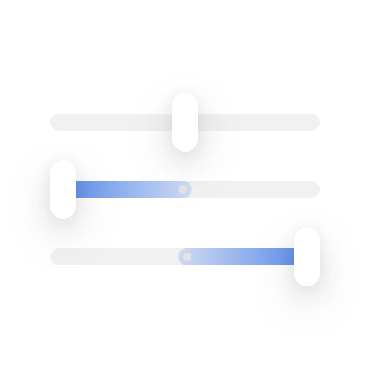
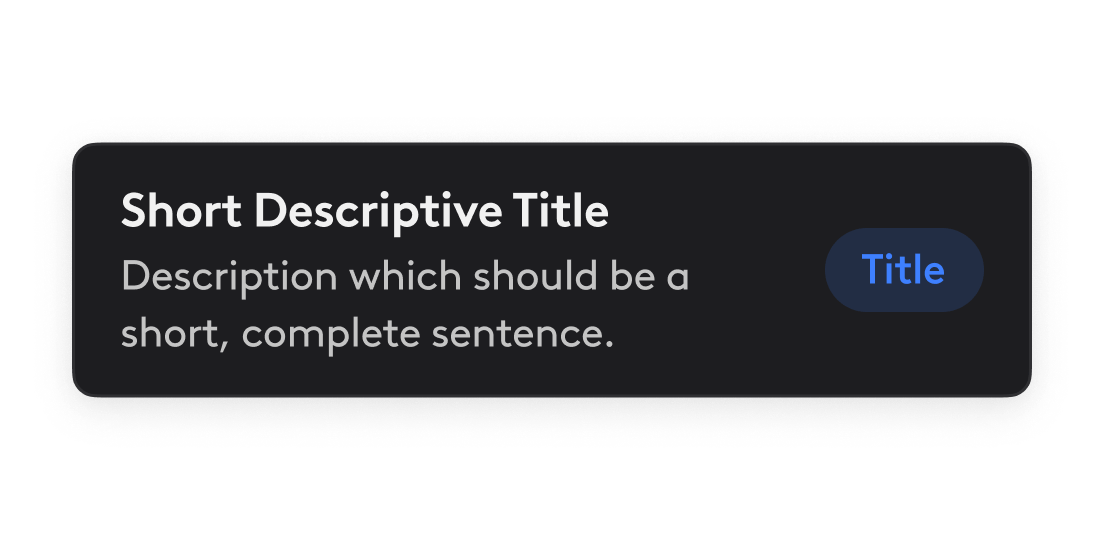
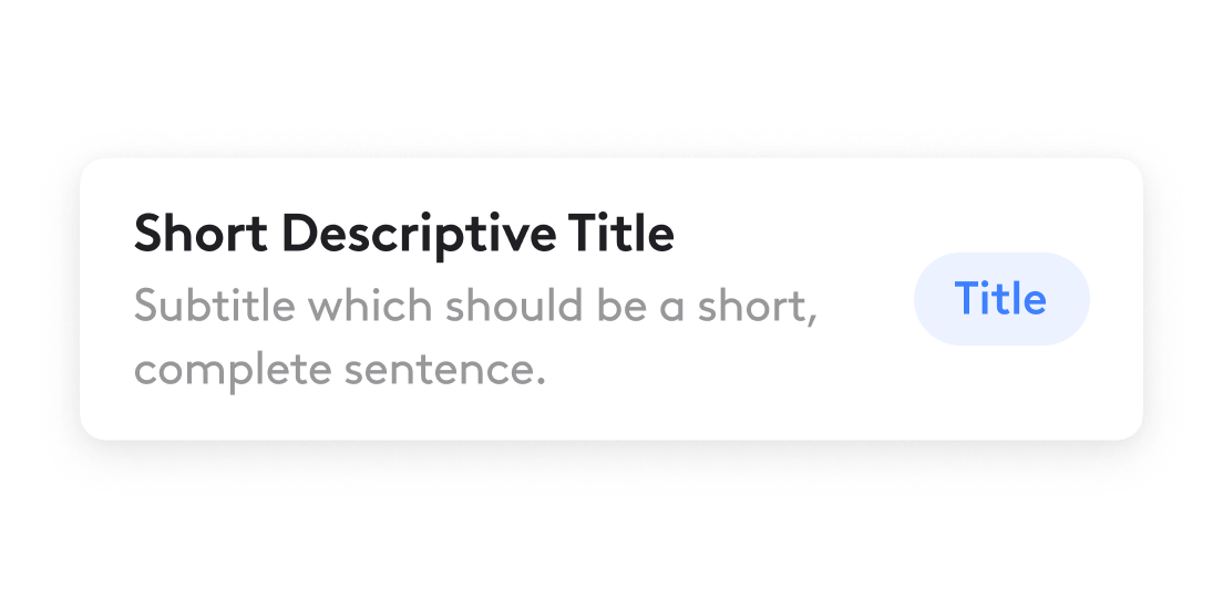
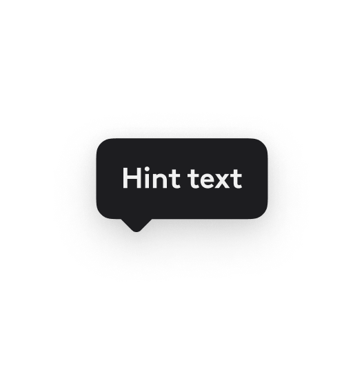
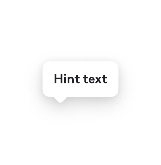
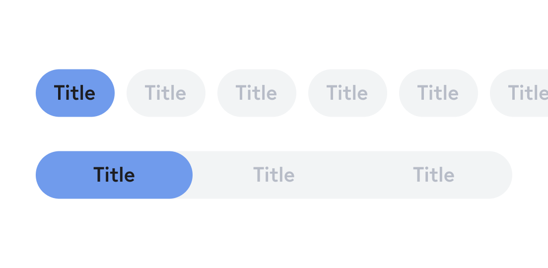
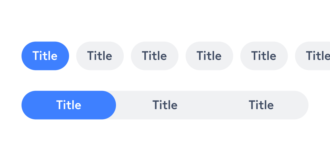
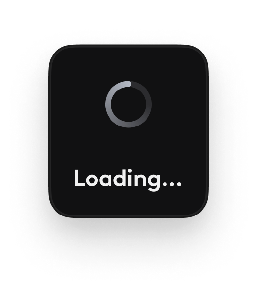
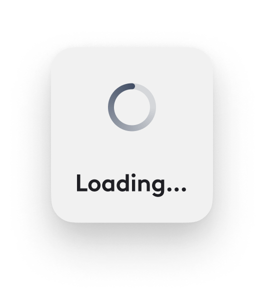
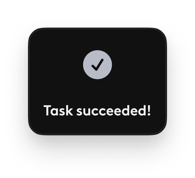
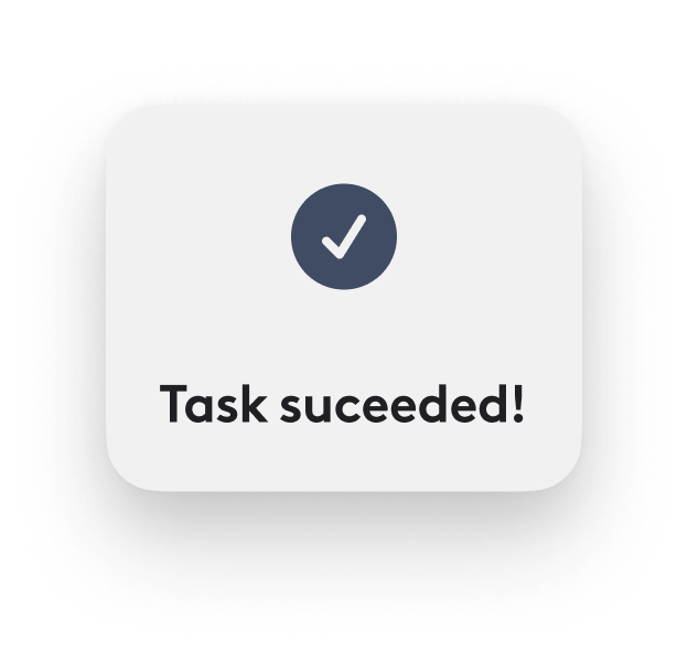
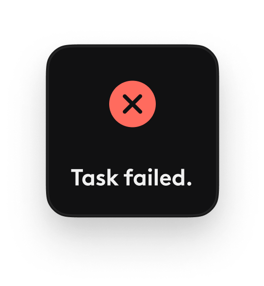
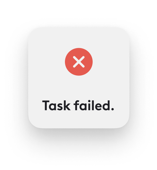
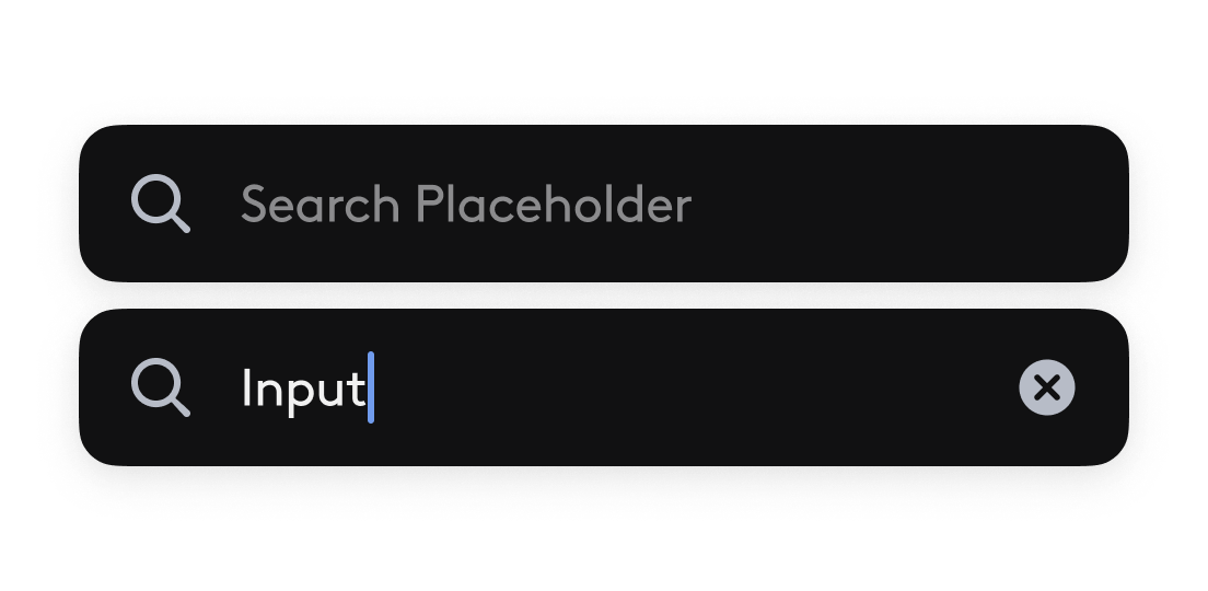
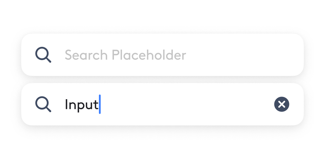
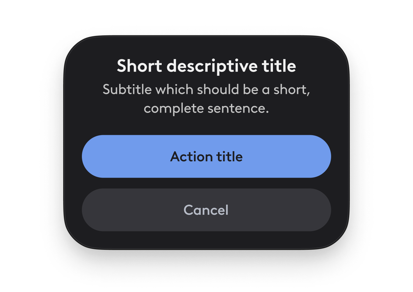
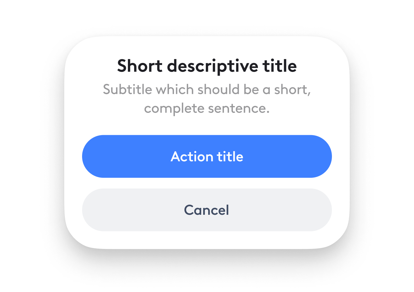
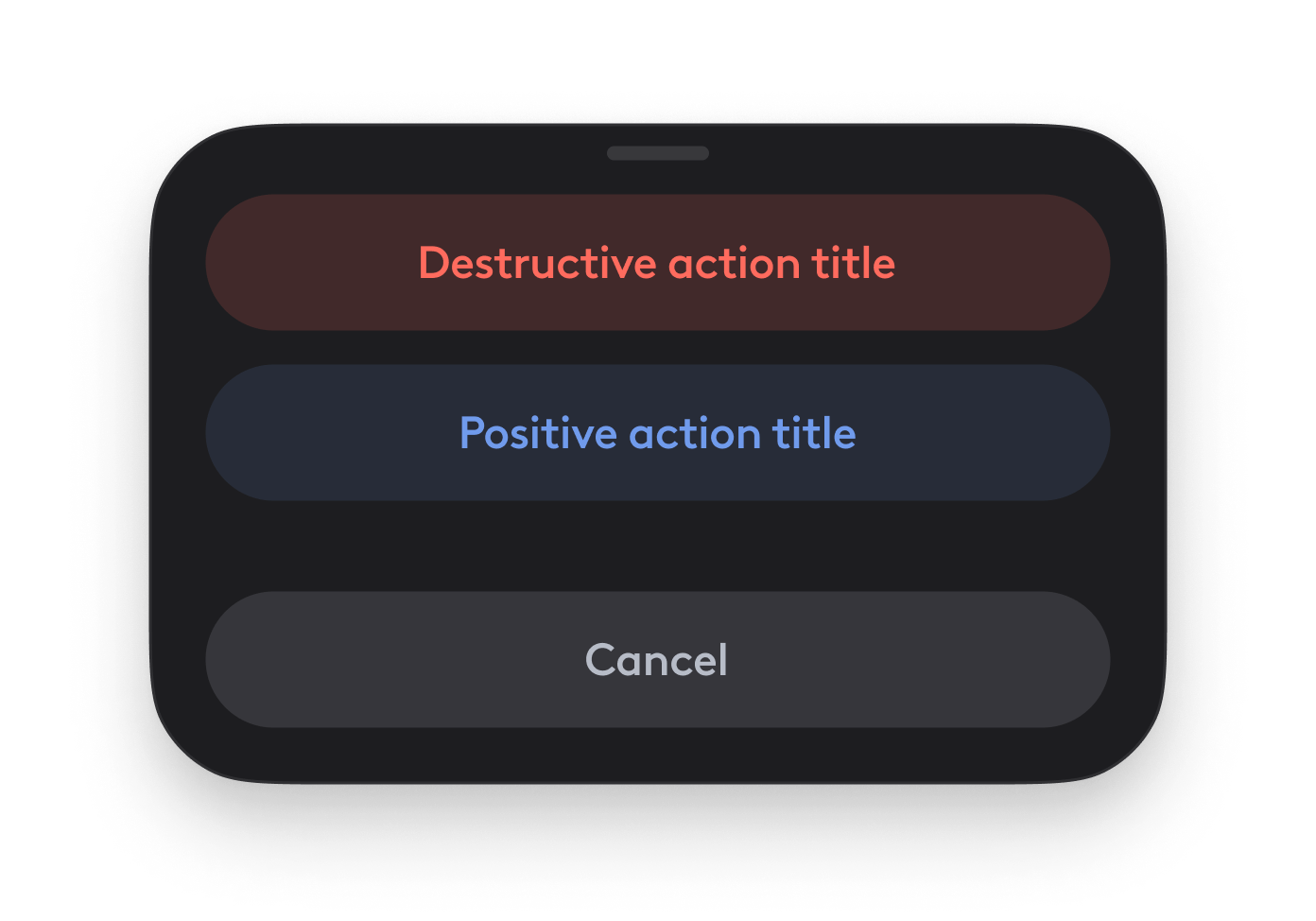
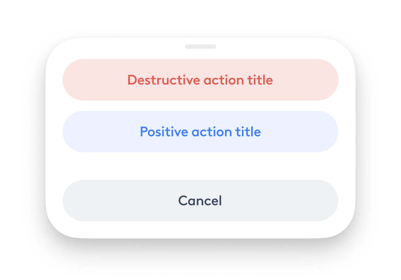
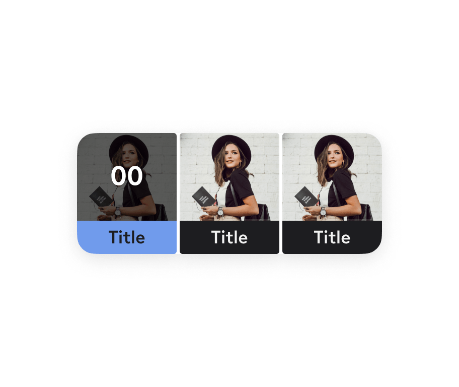
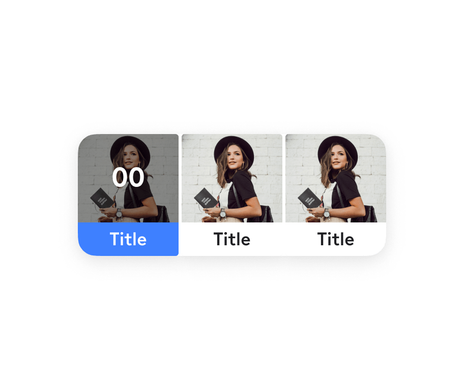
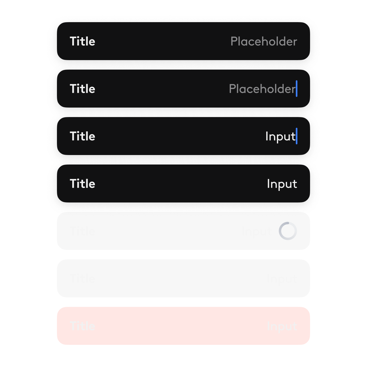
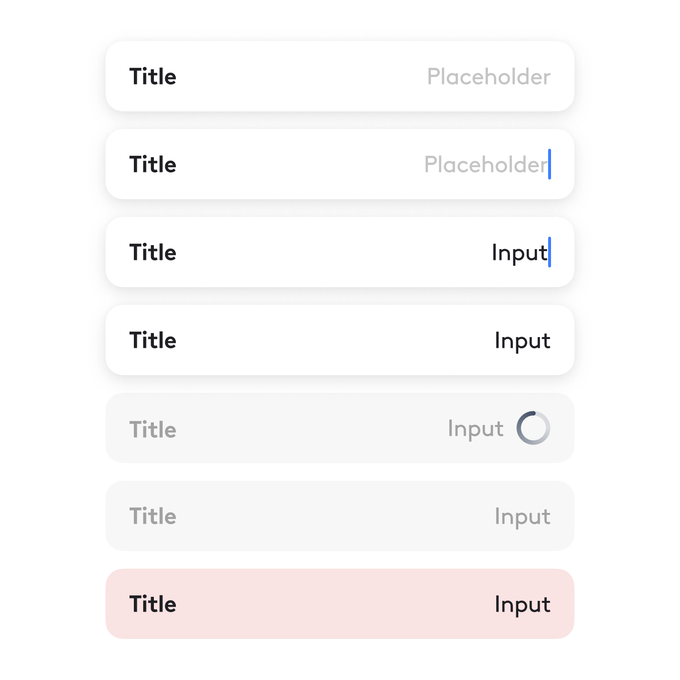
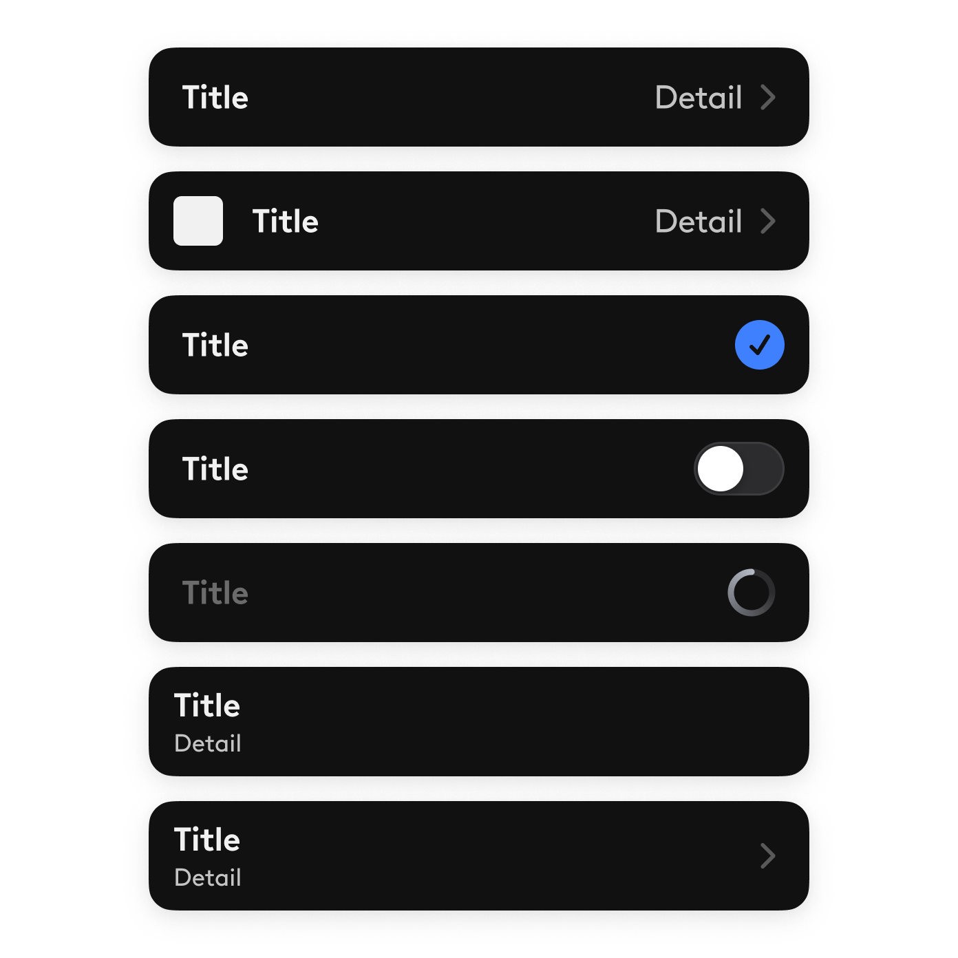
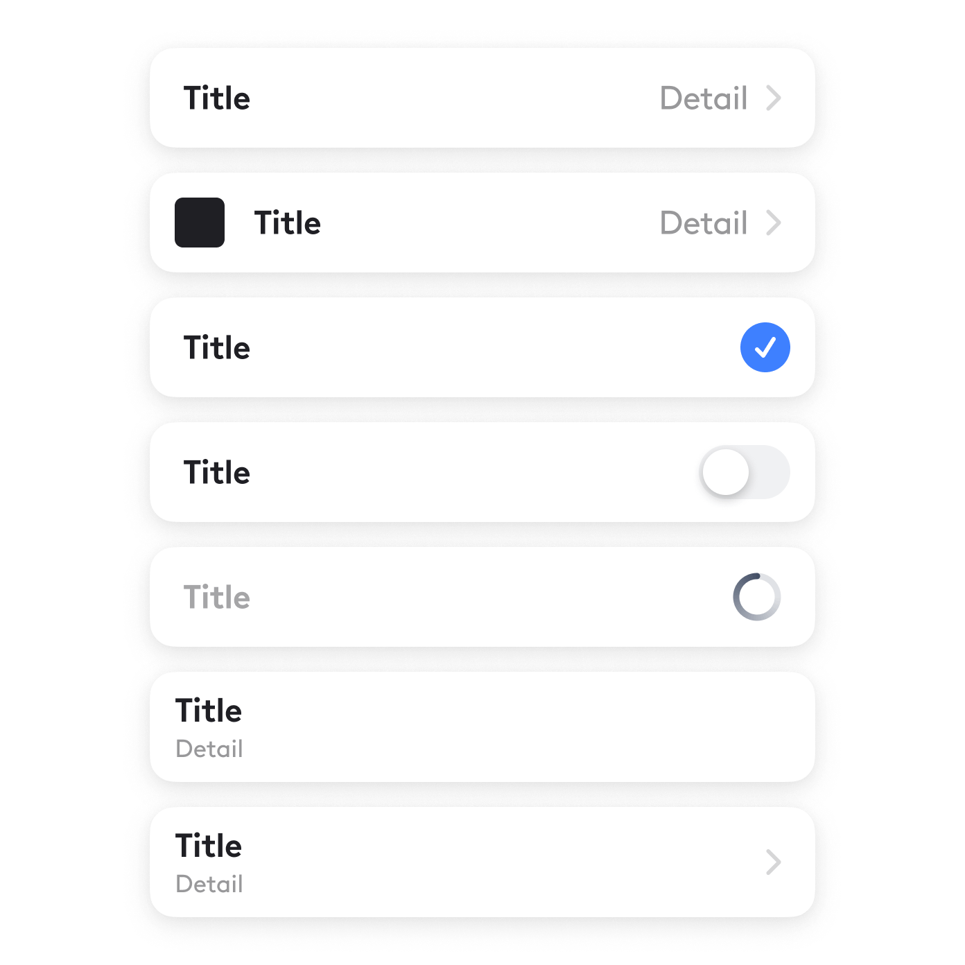
I have designed, prototyped, and defined 26+ platform-agnostic mobile components. Each component was built with the Lightricks design language in mind, bringing consistency and predictability across all mobile apps.


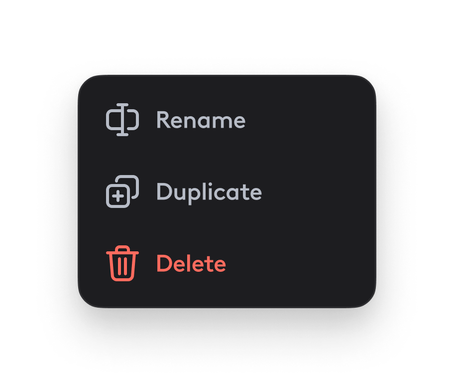
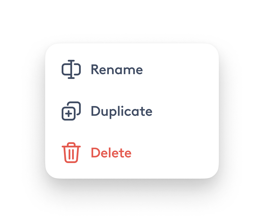
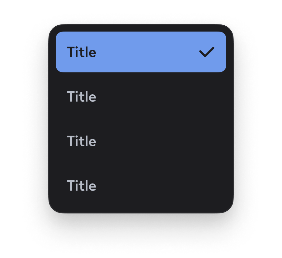
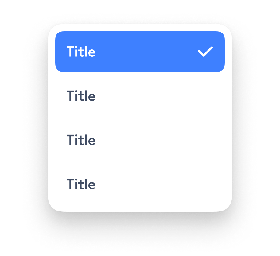
Web Components
In addition to mobile components, I have designed, prototyped, and implemented 30+ desktop components in React & SASS. I have catered for mouse & keyboard input on Desktop/Laptop, and taken into consideration web and desktop-specific information density and conventions such as radio buttons, checkboxes, and forms.
I have taken the initiative to design and implemented a React Web App which showcased the visual language as well as some of the web components.
Play with me!
Design Language
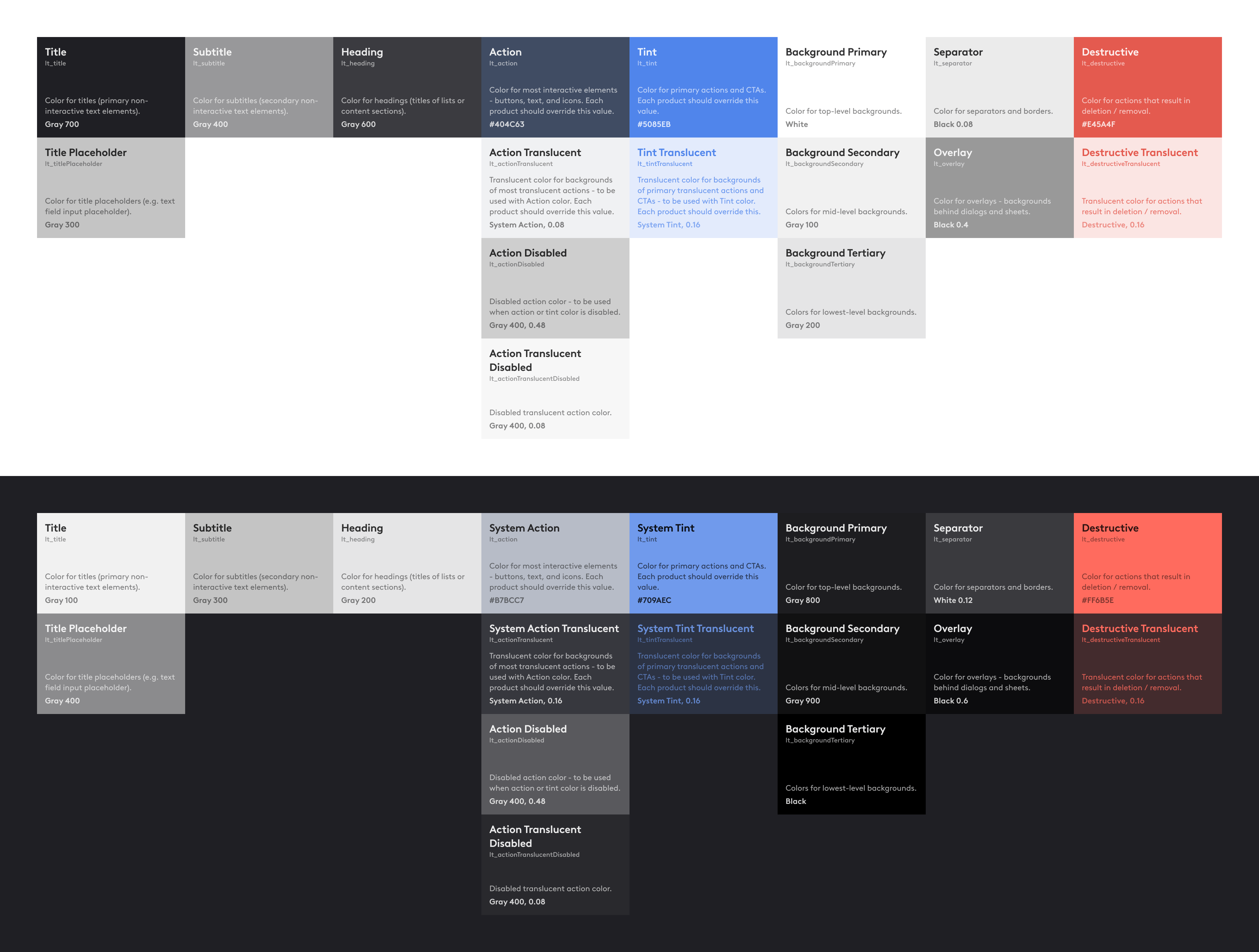
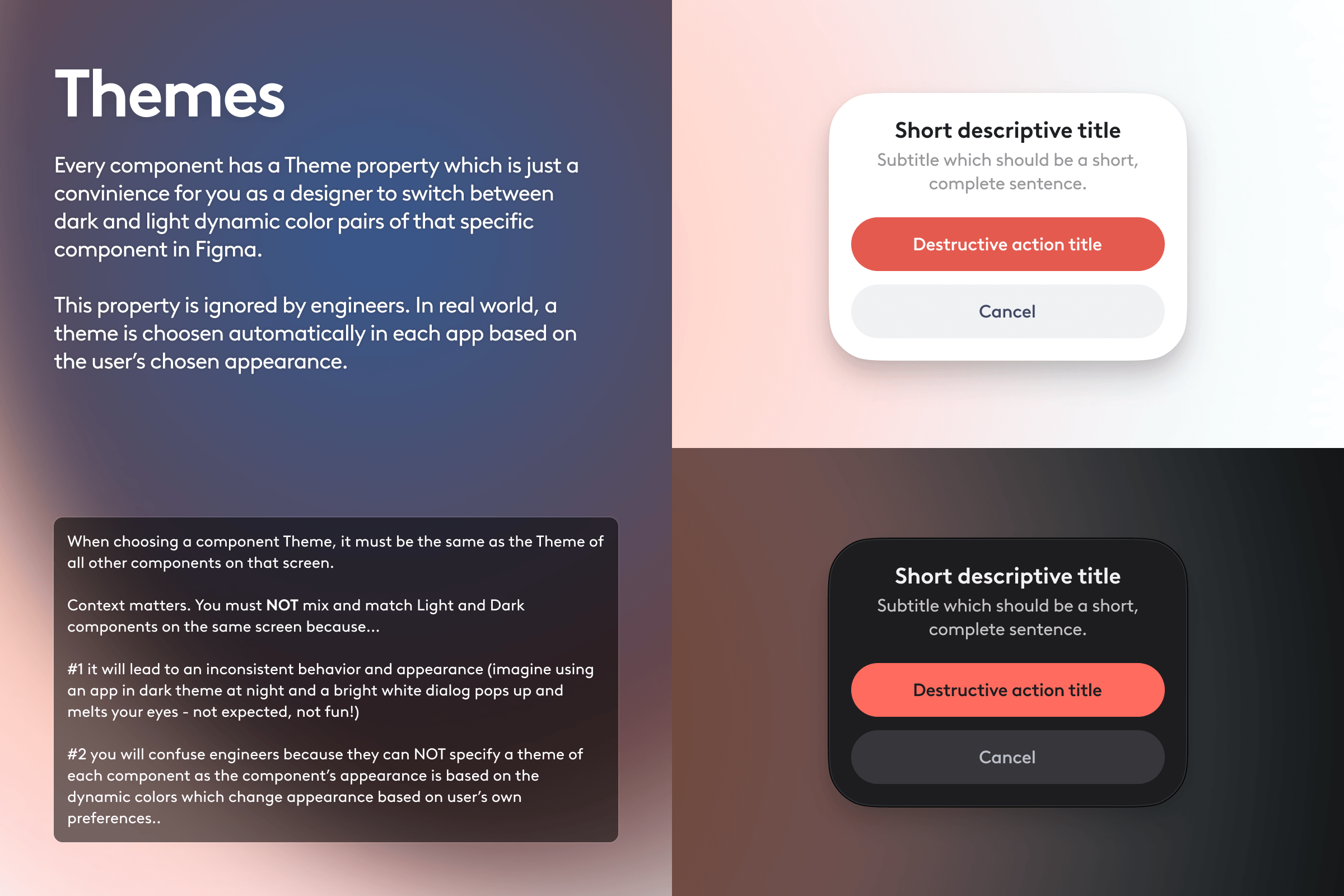
The design language library was intended to bring a consistent style across all products and platforms and included static colors, semantic colors, font styles, shadows, blur, corner radii, gradients, and grid system.
My contribution was a color framework which is appearance-agnostic, scalable, flexible, understandable to both designers and developers, and supports theming. We've made it easy for each product team to specify their app-specific accent colors in the so called Color Kit which would then impact how all design system components looked in their product.
iOS System Components
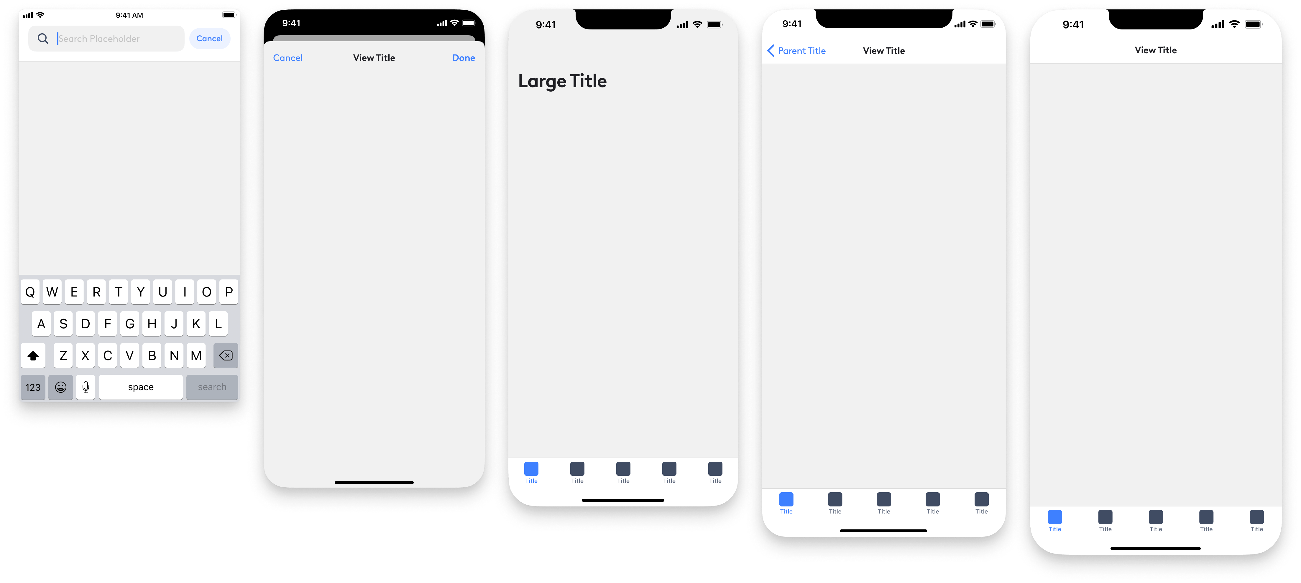
To make it easier for Product Designers to optimize their designs for specific devices, I have recreated many native iOS system components - making sure that each component had accurate variants based on the all the devices used by our customers.
Component Documentation
Design System is not just aesthetic artifacts. Documentation turns the Design System into something people can understand and follow and is crucial for adoption. My goal was to provide context and usage guidelines, so I have created the following structure written documentation for every single component.
Component Status
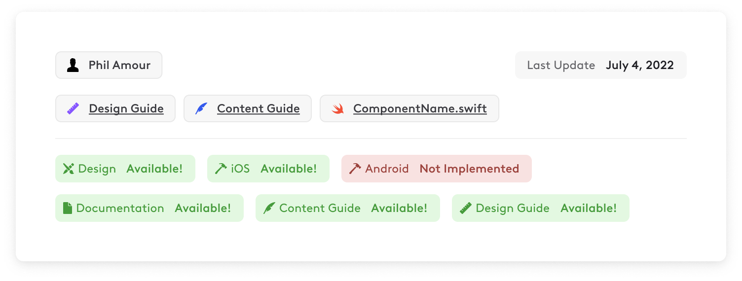
This section provides general details and references. It includes the name of the component creator and a point of contact, timestamp of when the component was last updated, link to a design guide created by the component designer and used by the development team to implement the component in code, content guide created by the content strategy team defining guidelines and examples of copywriting for that specific component and localization, link to the implemented component on GitHub, design status (not designed, in progress, pending approval, and available), iOS implementation status, Android implementation status, documentation status, content guide status, and design guide status.
Summary
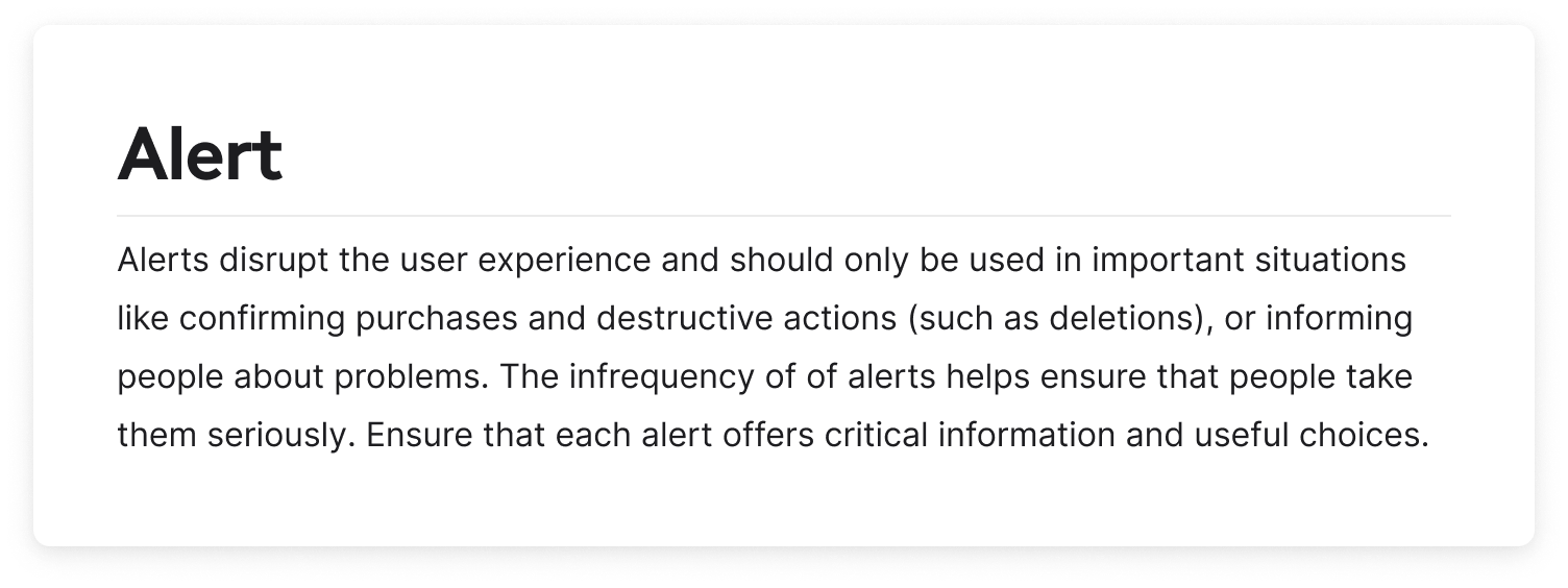
This is a general description of the component without going into too much detail.
Behavior
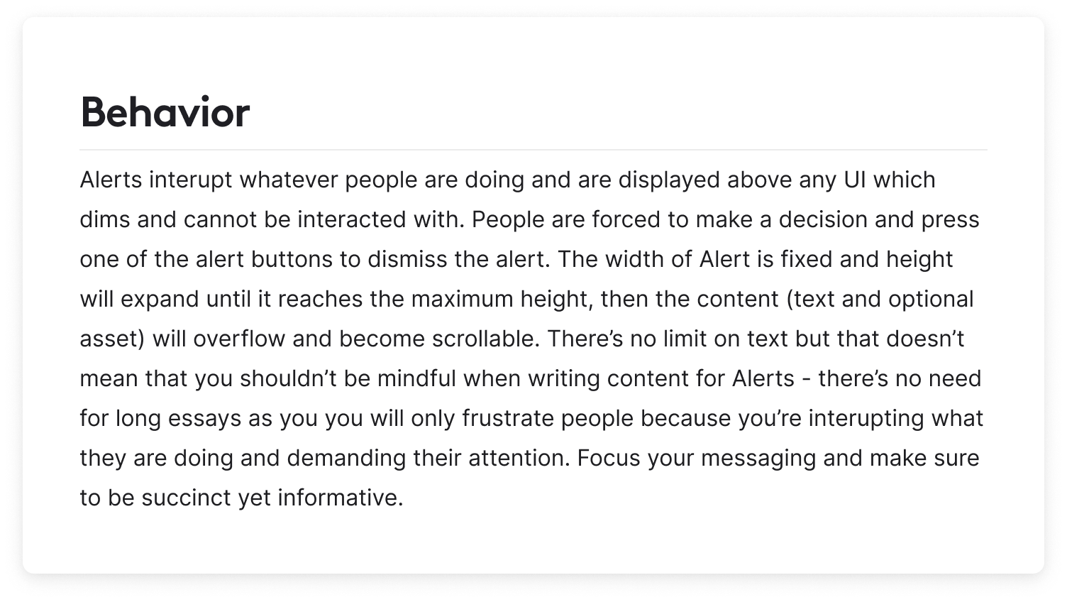
This section describes how the component works and adapts.
Usage
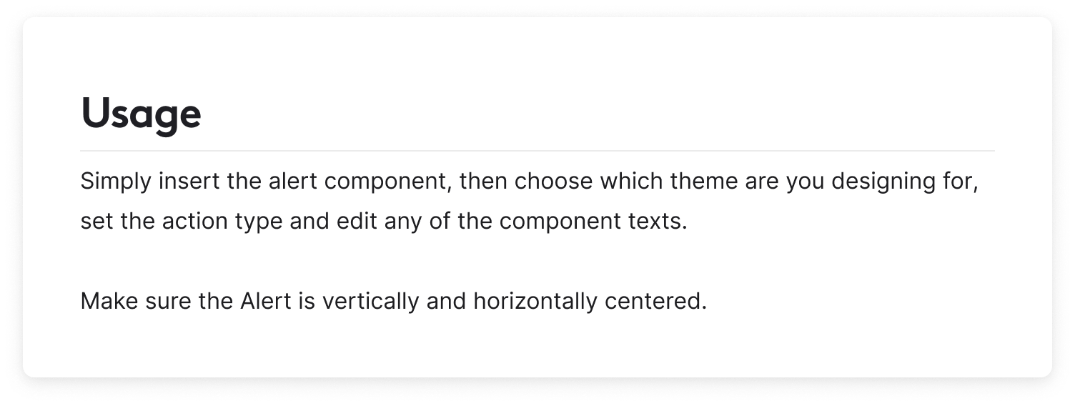
Guidelines on how the component is intended to be used.
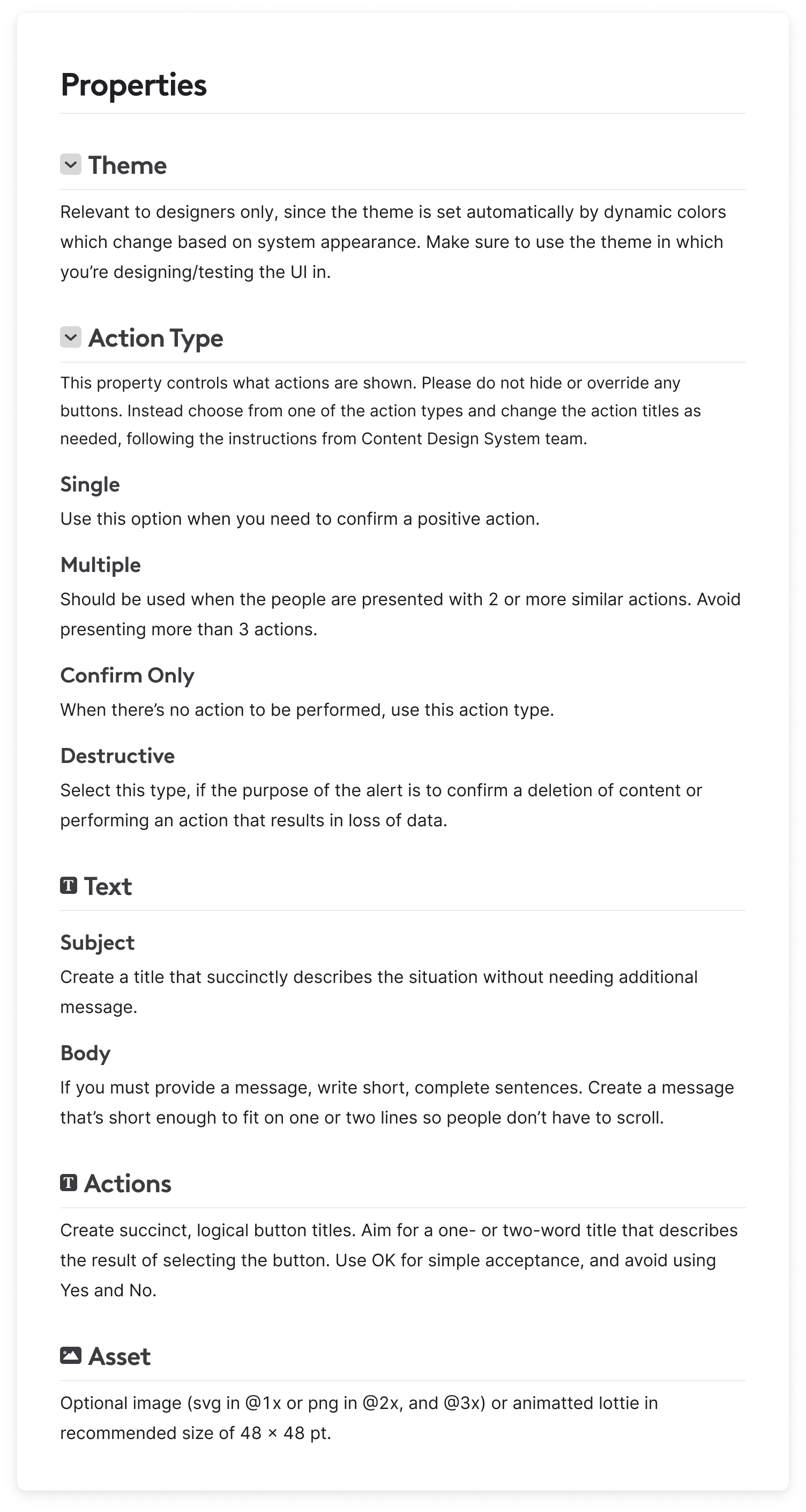
Properties
This section lists all the properties of the components that can be adjusted in both Figma and the codebase including any of the components' texts and assets.
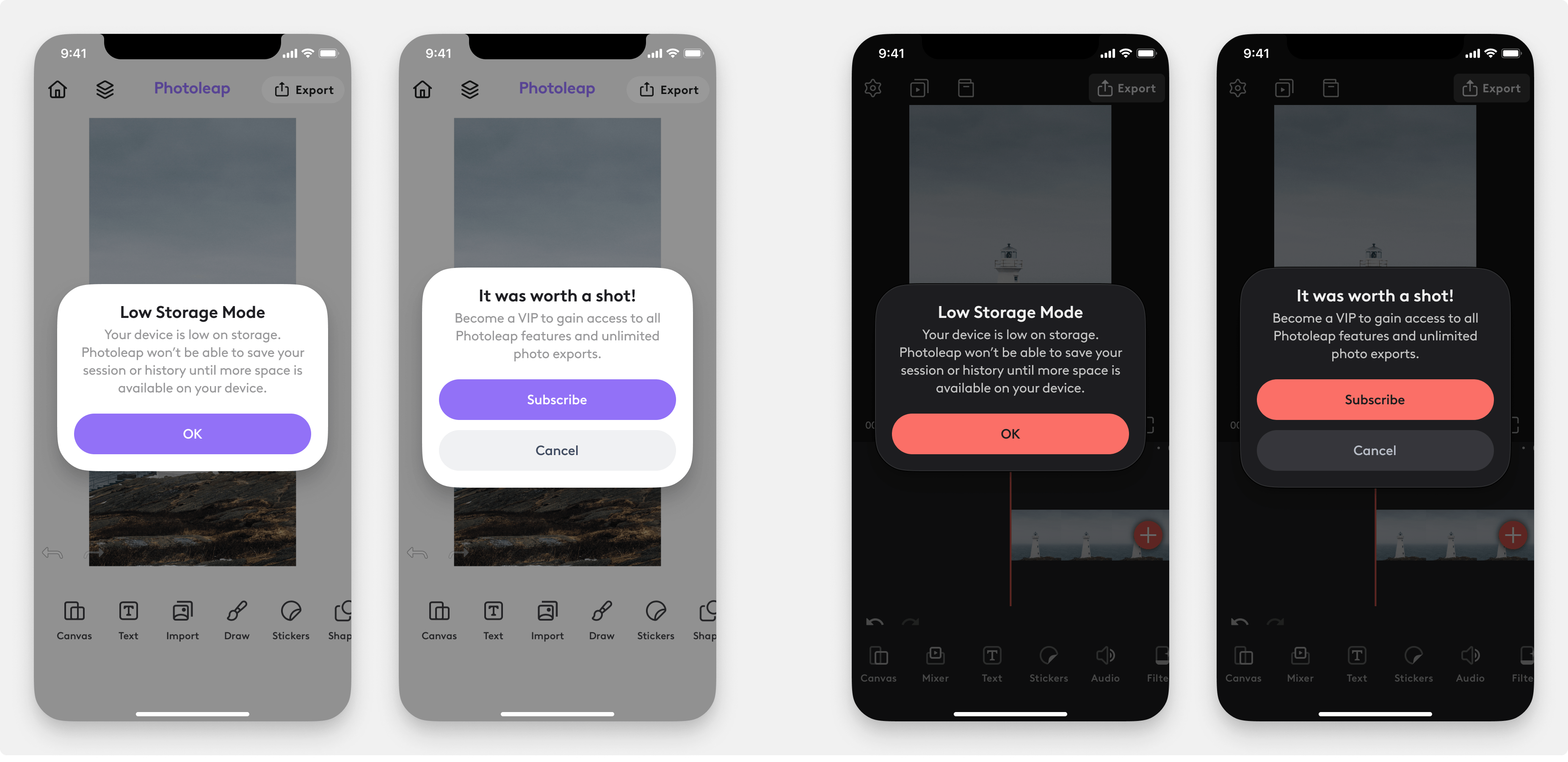
Usage Examples
To better illustrate how the component can be used, I have created examples section with real-world use of each component in one of the Lightricks apps.
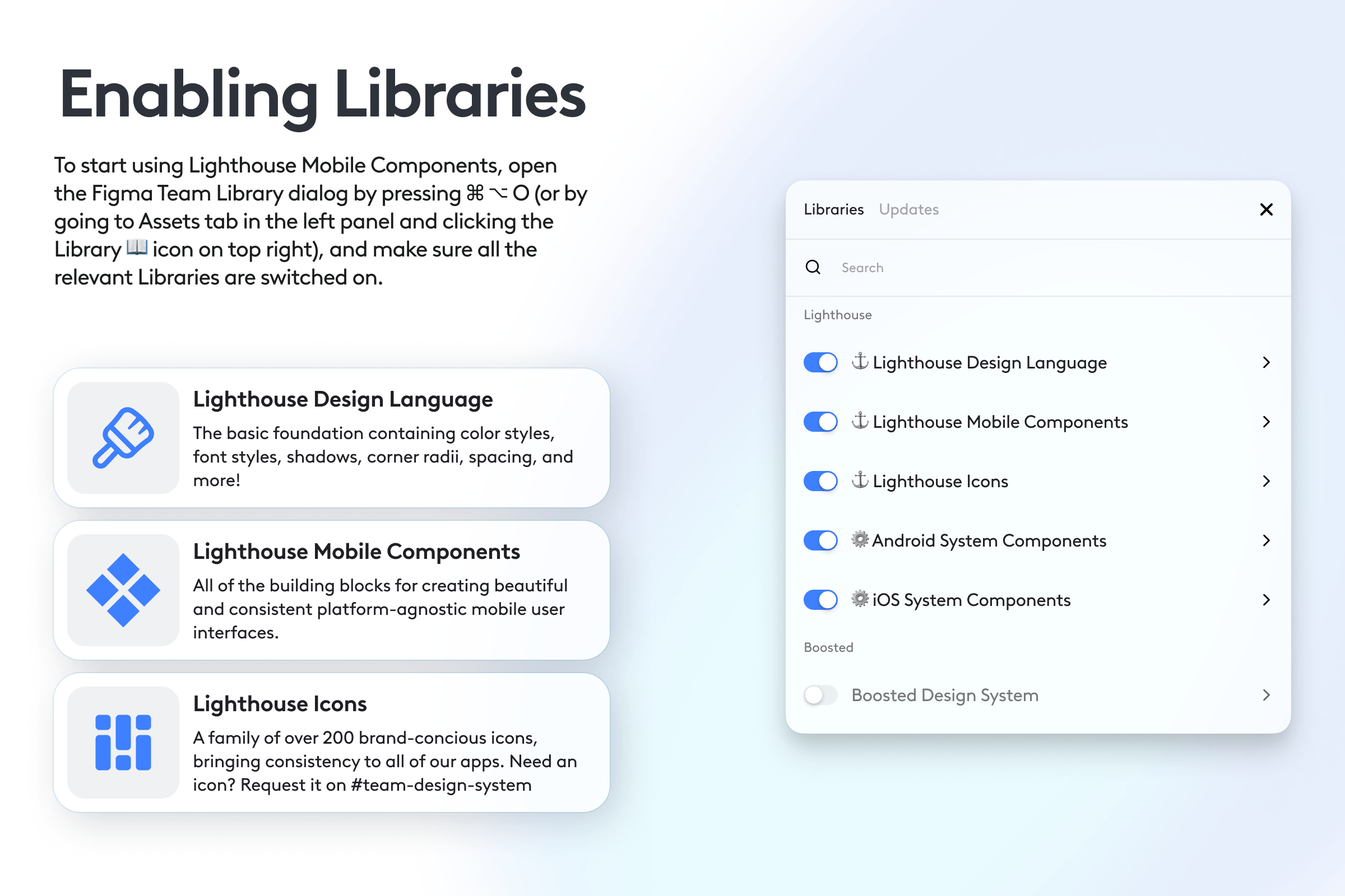
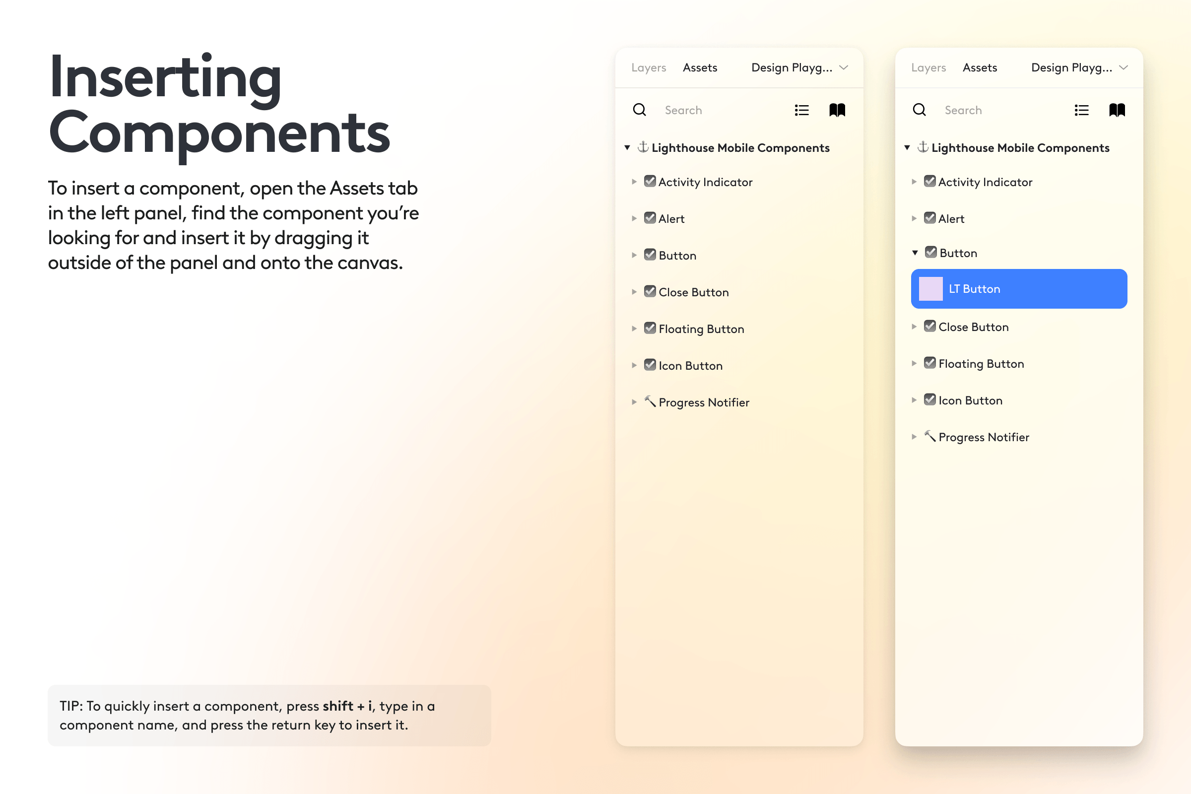
Instructions
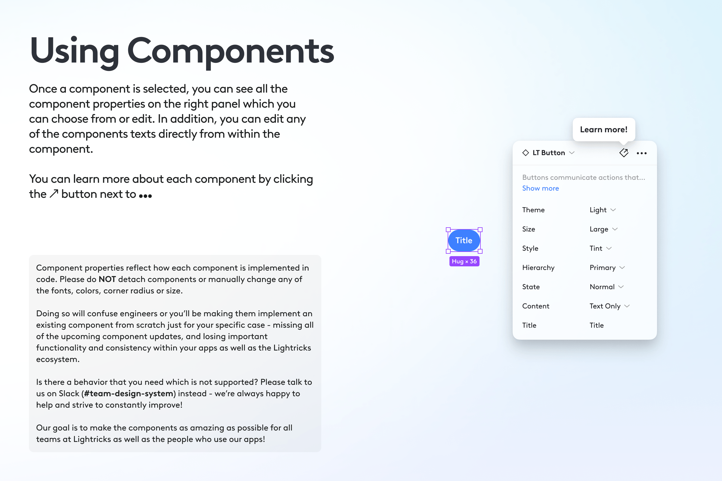
To help designers get started, I have created a set of instructions on how to use the design system.
Mobile App
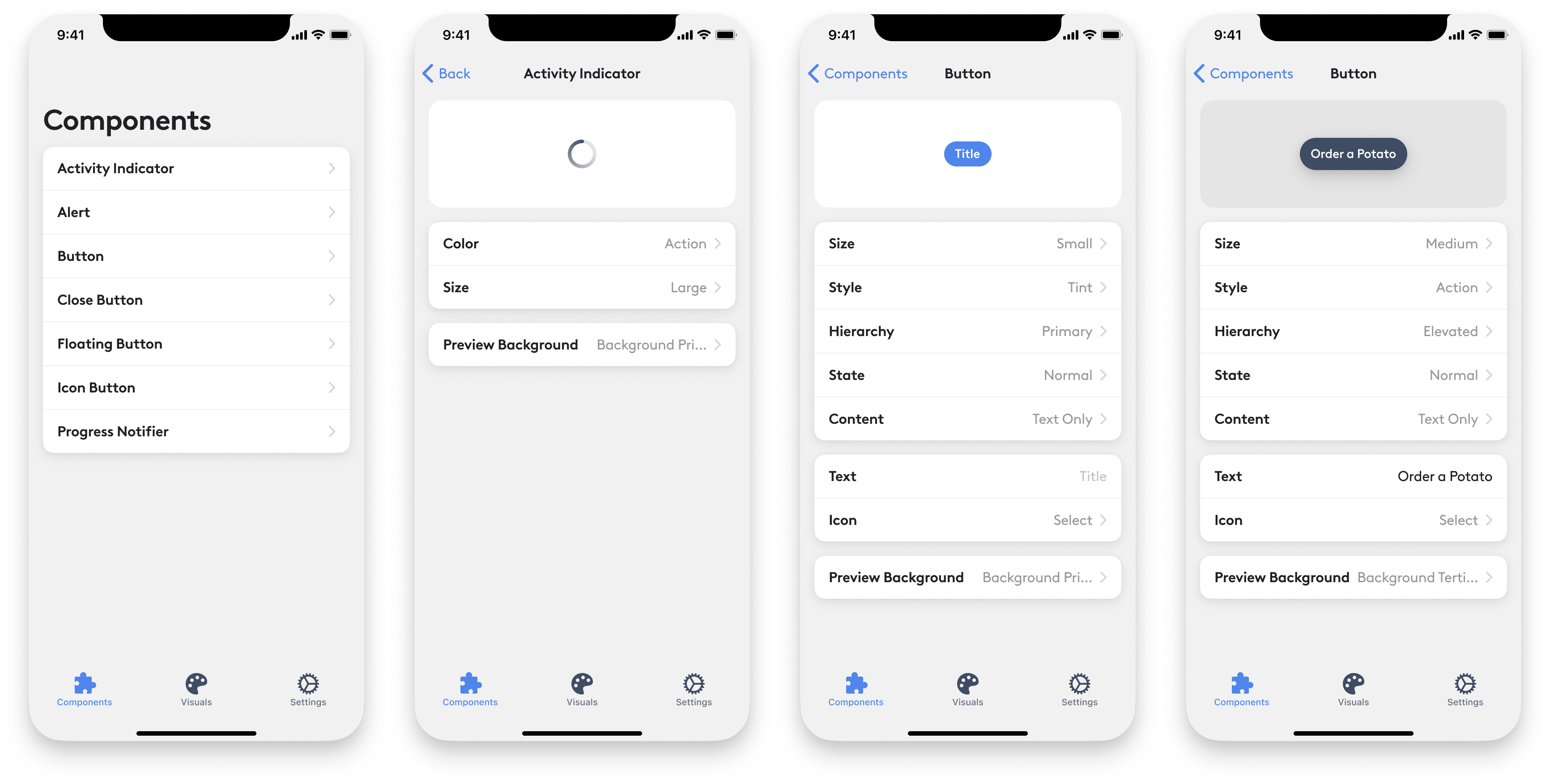
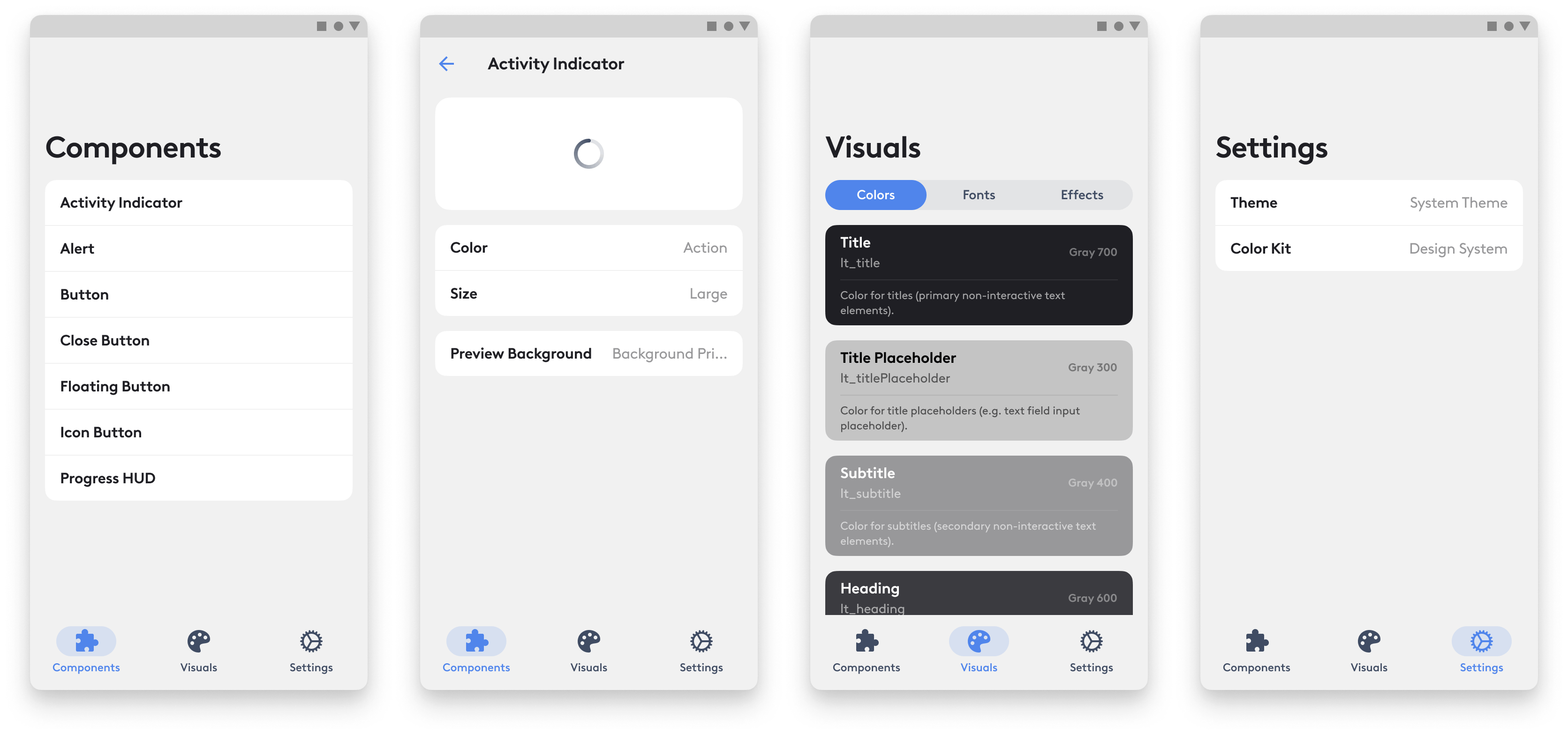
In addition to the design system in Figma and a repository of Origami Prototypes, I have designed and worked with developers to develop an internal iOS and Android app that would showcase all the implemented Design System components with all the properties exposed and adjustable, as well as serve as a portable guide for the design language styles. Anyone at the company could download the app to see, tweak and interact with all of the implemented components, switch between color kits and schemes, as well as test out cross-product experiments.
Mobile Project Template
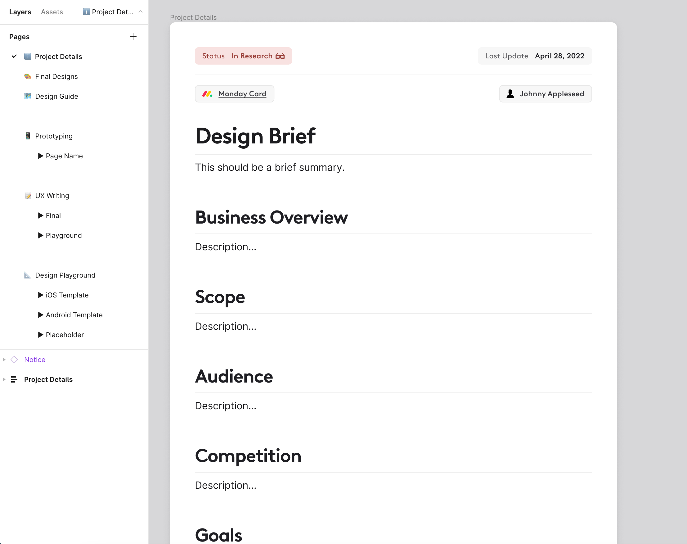
To make design process more organized, efficient, and consistent across the organization, I have created a Figma mobile project template for Product Designers.
Each file was structured to follow a part of the company's design process and included project details page with a design brief and more context around the project, final designs page, design guide page, prototyping section, ux writing section for ux writing team, design playground section for exploratory designs with iOS and Android design templates that I have created to make it easier for designers to get started, research section for ux research, new components page, and archive section.
Results
The Design System team has assisted multiple product teams with migration to our Design System, the latest being Facetune.
Product teams are seeing improvements in design and development efficiency, and shipping faster.
Common language between Product Designers and Developers is leading to better communication and results.
Consistent UI and interaction design translates into increase in subscription rates and retention.
Every product that migrated has cut hundreds of hardcoded colors down to ~20 design system colors.
Products which migrated to Design System have provide more consistent and predictable experience.
Improvements in cross-product efforts - the Design System is used by cross-product teams to design new features such as Feed and Onboarding.
We're seeing great adoption rates of the design system styles and components across all major product teams.
After working closely with the Facetune team to redesign the Facetune app with the Lightricks Design System, the team is not only working more efficiently but receiving positive feedback from users and seeing an uptick in engagement and subscription rates.

“I had the pleasure of working with Phil during his time at Lightricks. During our time working together Phil proved to be extremely detail oriented, while also demonstrating a deep knowledge and understanding of both the technical requirement and limitations, as well as user needs.
During his time at Lightricks, Phil undertook building out our design system collaborating both with our infrastructure team to build out our components library, to work both visually and functionally across Lightricks numerous iOS product. While collecting requirements and feedback from all stakeholders and products to meet each teams specific needs and requests. Our products have never looked so polished and we owe it to his incredible efforts and attention to detail.”
Judah Guttmann
Former Product Manager at Facetune


“Phil is one of the most professional designers I’ve had the pleasure of working with. Always a deep thinker, extreme edge case detector and prototyping master. He’s helped tremendously in taking product design at Lightricks to the next level and I hope our paths cross again soon!”
Tal Moskovich
Former Product Design Lead at Lightricks

“Phil is a very talented designer and it was a pleasure working with him and managing him. He is very dedicated to keeping a high quality of work, both from a UX and a UI perspective. Phil is also very organized and knowledgable, always up to date and up to exploring new things. Last but not least, Phil did an amazing job working on Lightricks' Design System! So, go ahead and hire him :)”
Laure Scemama
Product Design Team Lead at Lightricks


“I’ve worked with Phil on implementing an in-house design system. Besides creation of detailed and well thought design guides, Phils have great technical abilities. He always created interactive mocks of the design guides and when necessary dived into the code and tweaked it. And as a bonus Phils is a great guy to have a conversation with.”
Michael Kimi
Software Developer at Lightricks


“Worked with Phil on an internal Design System that is used across multiple apps. Phil is a professional designer who is comfortable around code and is easy to work with. As an engineer I often find that working with Designers invokes challenges that arise from the different languages we speak, but with Phil it was a breeze, he knows to speak developer, he makes design guides in ways that are easy to implement in code and he provides mocks and prototypes for everything!”
Netai Benaim
iOS Developer at Lightricks
