Snupps
Snupps
Love your stuff. Organize, Connect, Buy & Sell.
2 Million +
Registered Users
12 Million +
Items Added
4.8
Rating on the App Store
Featured by Apple
New Apps We Love
Featured by Google
Best Apps of 2015
Making an Organizer for Everyone
The core value proposition of Snupps is to enable people to catalog, organize, and keep track of the stuff they own. While it’s solving an unique problem and exists in a market where it doesn’t have many competitors, the focus of the business has always been to provide a simple yet powerful but easy to use solution to wide audiences that goes above and beyond to make people’s lives easier. Even tho many new features were added, the organizer is right in the center of the Snupps experience and it’s something that’s always being improved on to deliver the greatest experience possible to the core consumer base.
Onboarding
First impression is important. After going through the Sign Up process, newly acquired consumer should commit to the product instead of being left stranded with no help to get around, no motivation to go on and confusion about what does this app do for them. The experience shouldn’t feel like a tiring chore. We want to help the user as much as possible without being annoying or patronizing, help them understand what the app can do for them and set up a journey for their success.
Based on qualitative and quantitative analysis, we’ve identified what are the key parts of our onboarding process that can make or break the first experience and learned about what makes people return to the platform. These findings were used as a framework to design a new improved onboarding which resulted in higher retention rate and more creations of items.
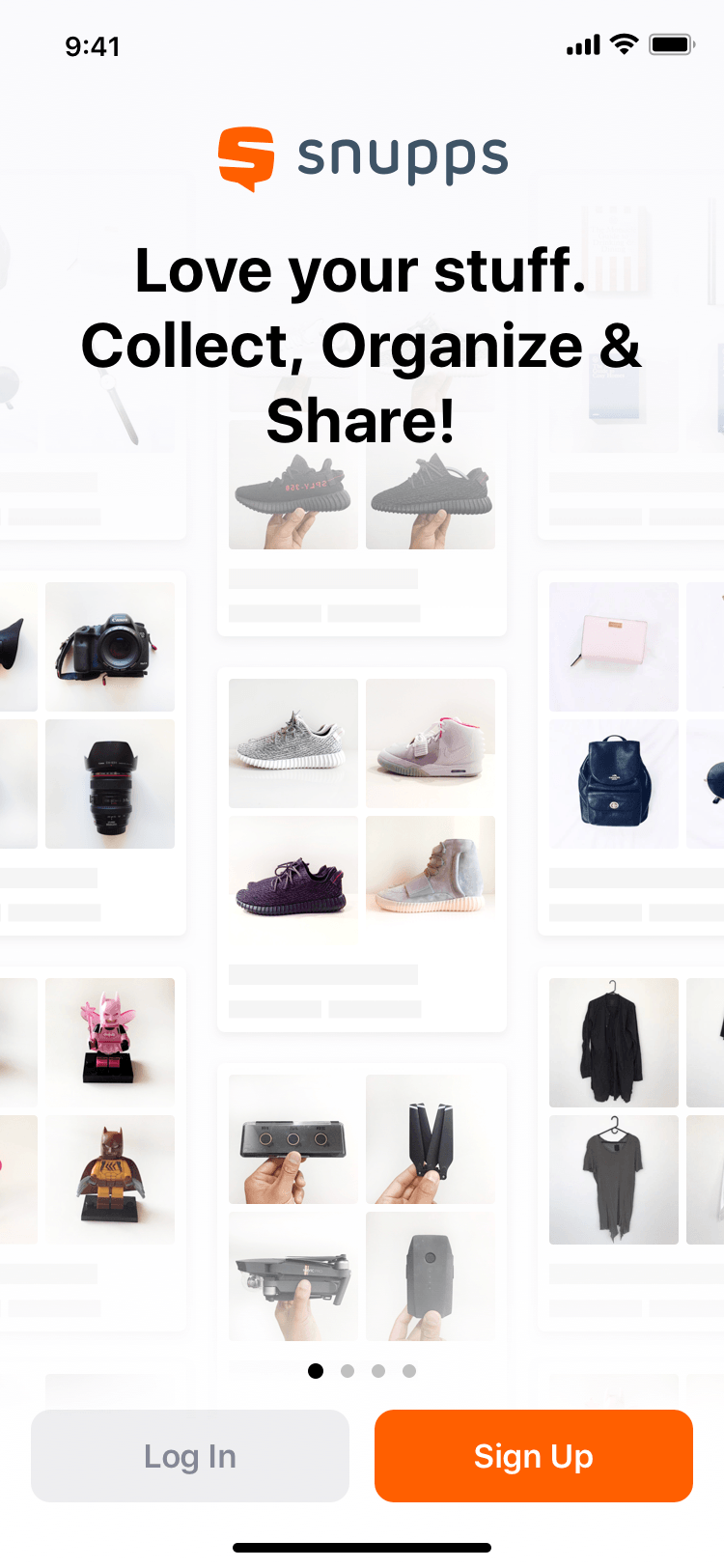
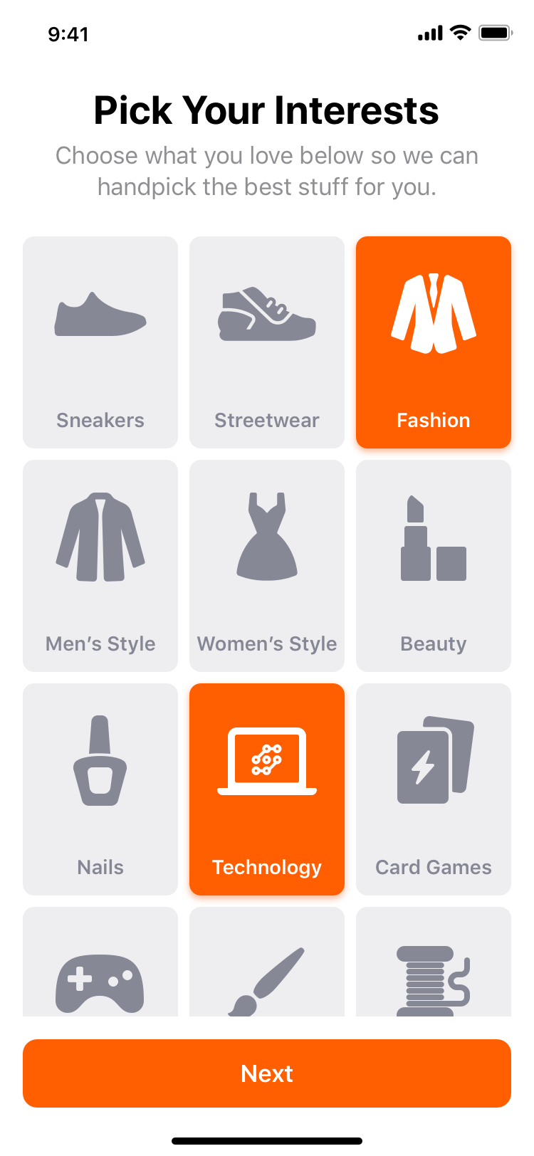
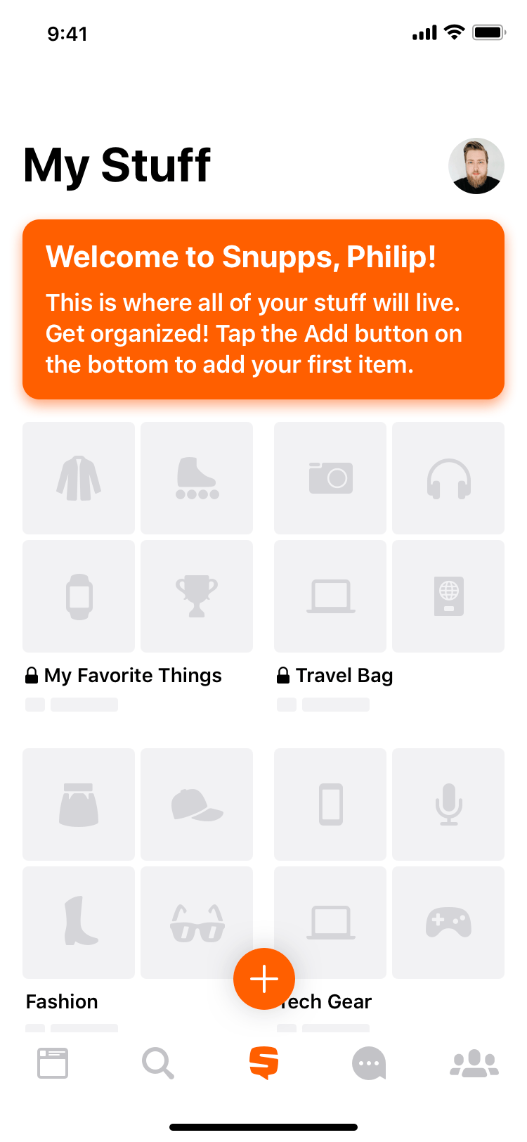
With the new experience, we gather people’s interests as they sign up to detect how do they intend to use their product and based on that we pre-populate the first screen they see after sign up with template shelves (a is a collection that holds multiple items) that are popular within that particular cluster of users who have selected similar interests. As a result, the first post-sign up experience is very relatable, gives new users an idea of how they can use the product and placeholder icons encourage you to get started and add your own stuff. They are welcomed and motivated to get organized with a single tap of a button.
Capturing Items
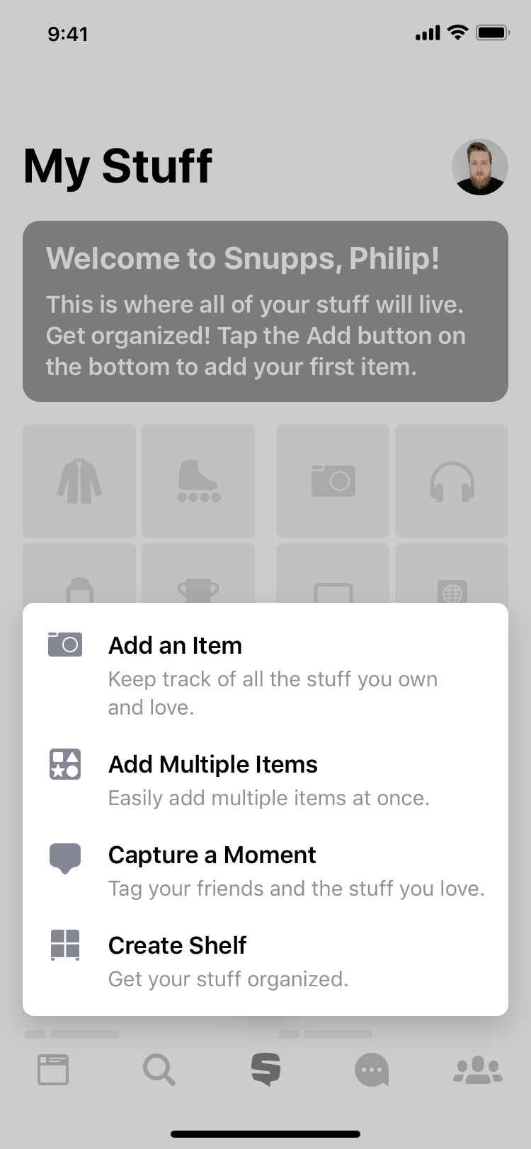
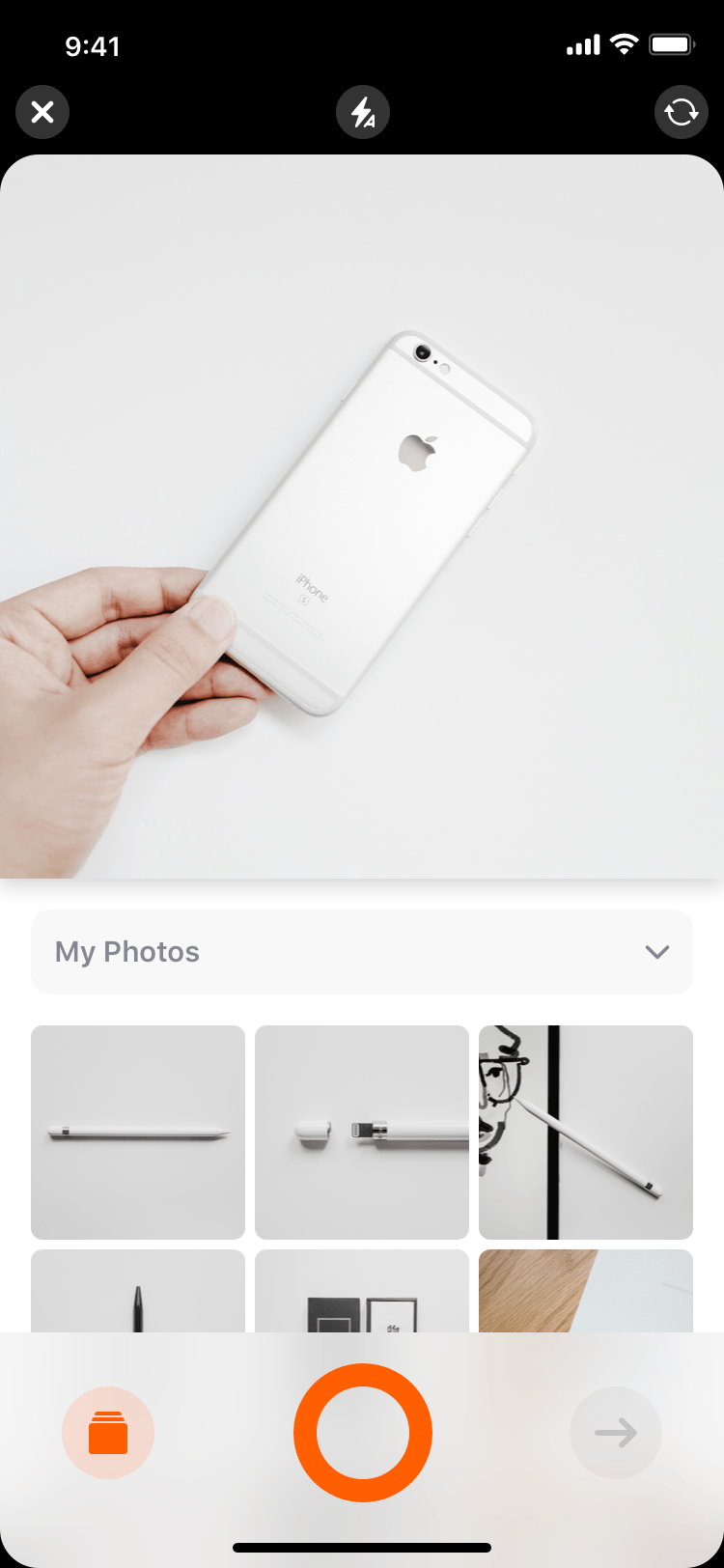
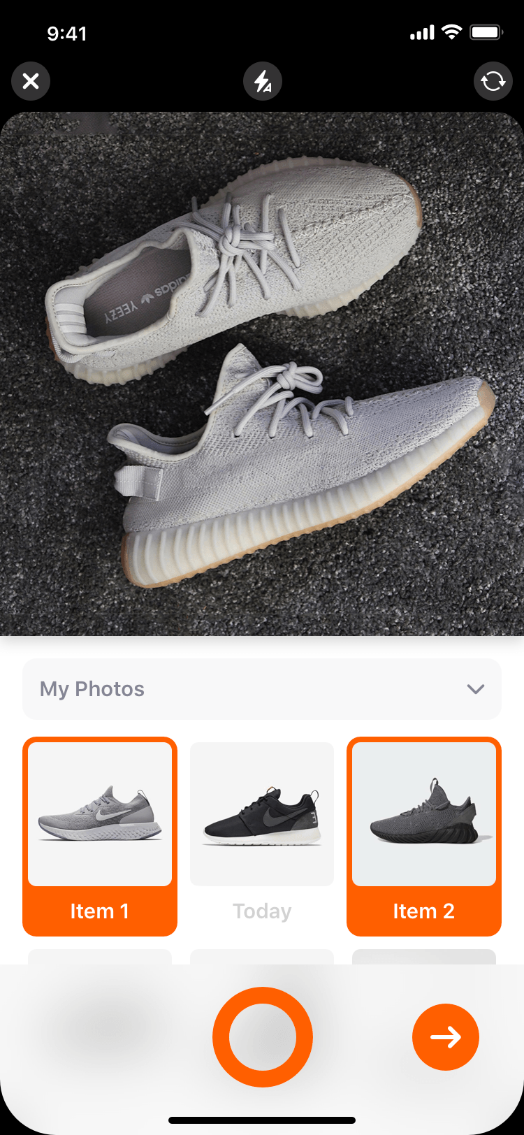
This is where the organizing begins. Initially just an import from the Photos Library, we wanted to make digitizing of physical belongings easy to use but powerful enough to allow for adding multiple items at the same time without going through the same process over and over again. After extensive analysis and user testing, we’ve realized that this is an incredibly hard problem and we’re still trying to figure out a solution that works for everyone and is not confusing.
We developed multiple solutions that were tested with people and adjusted on the go. At the end of the process, we were confident with the first iteration. User testing helped us narrow down a possible solution that worked for majority of the testers. When we rolled out the feature, we realized our work wasn’t done there.
The assumption was that quantitive analytics would help us to answer some questions such as what people prefer - selecting existing photos or taking pictures? Do they prefer capturing multiple items at the same time or do they add a single item at once? Unfortunately there’s no clear solution that fits all and the experience will be tailored in the next iteration based on the user needs - we will have clear separation between adding a single vs multiple items and have a great experience for both the people who choose images from their Photos Library as well as people who prefer to take a picture with the app.
Adding Details
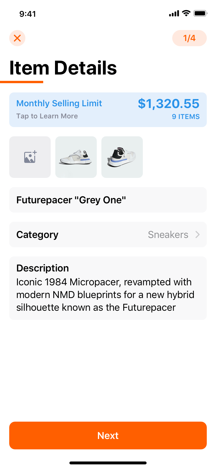
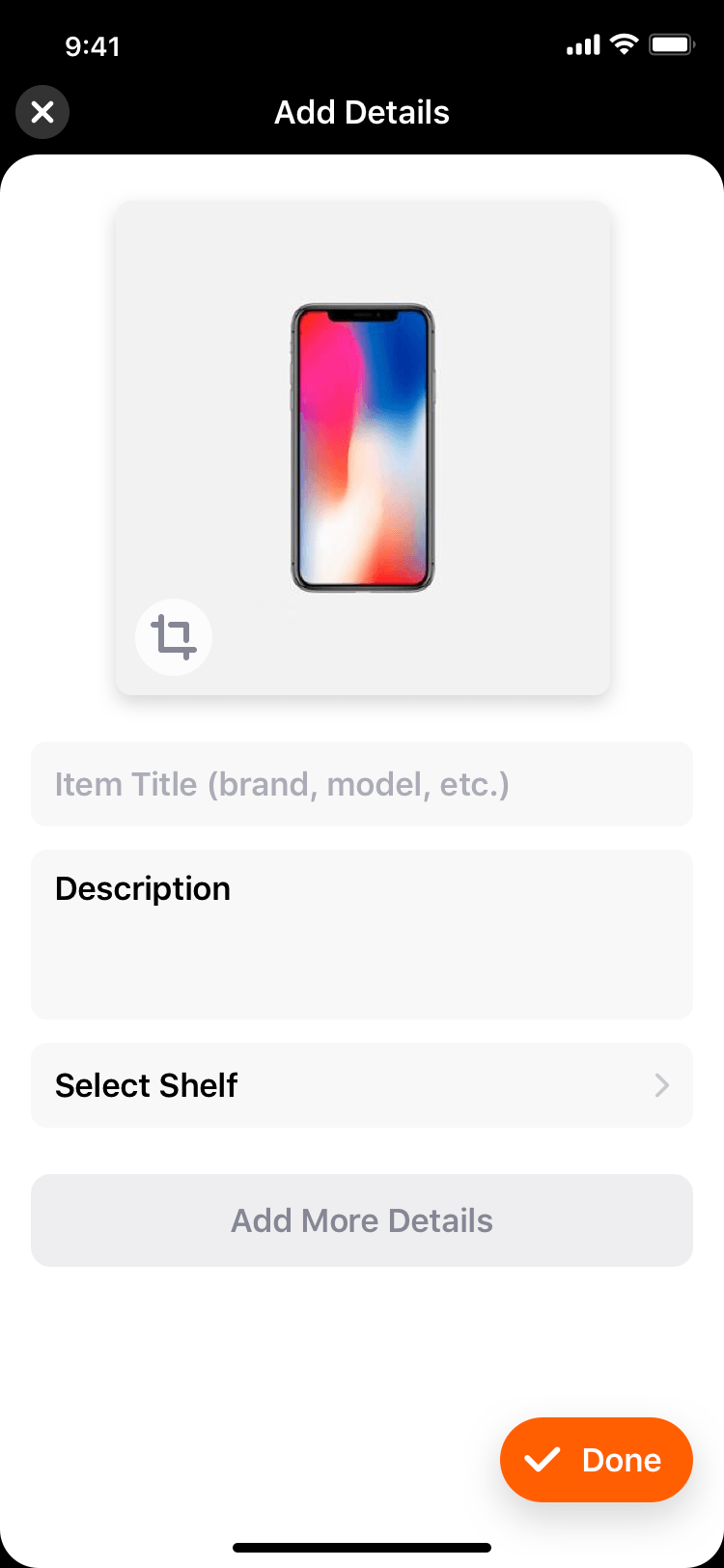
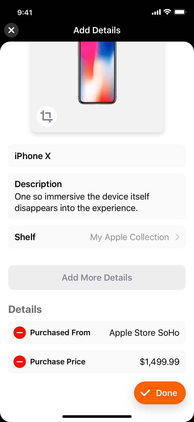
It’s all about the details. Once the customer has captured or imported images of their stuff, they were required to fill in additional details such as title, brand and location. User testing has revealed that making additional details mandatory had an effect on items added per person - people felt like it was a chore having to fill in additional details so we iteratively made additional fields optional which increased items added per customer and retention. Majority of the user testing panel revealed that they would prefer to add images of their items first and then later add more details.
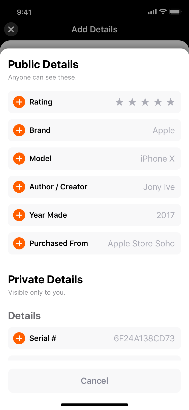
After additional analysis, testing and interviews, we’ve discovered that even tho additional details are not mandatory, people felt like they had to fill additional details in and seemed quite overwhelmed. Based on our findings, we’ve decided to surface only the most important fields such as title and description and added a button that expands additional details for customers when they are ready to fill in more information. After rolling out this change, item additions has increased further. We’ve learned even more since then and are planning to introduce an improved interface that lets our customers customize the interface based on which fields they use the most.
After additional analysis, testing and interviews, we’ve discovered that even tho additional details are not mandatory, people felt like they had to fill additional details in and seemed quite overwhelmed. Based on our findings, we’ve decided to surface only the most important fields such as title and description and added a button that expands additional details for customers when they are ready to fill in more information. After rolling out this change, item additions has increased further. We’ve learned even more since then and are planning to introduce an improved interface that lets our customers customize the interface based on which fields they use the most.
Organizing
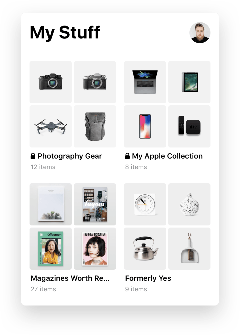
Powerful can be made simple. The core product proposition of Snupps is to help people organize their belongings so they are aware what they have, where things are, how much is their stuff worth, etc. After adding your stuff, organizing it should be straightforward and easy to do - like taking an object and placing it on a shelf and that’s exactly what we ended up with. We’ve taken a real life process and made it simple and joyful. When people are taking pictures of their stuff and filling in optional details, they can select a shelf to put the item on to organize it. It’s entirely optional in order to make the process as frictionless as possible.
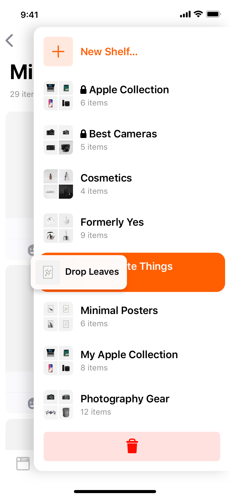
People can simply choose to organize their stuff later and until then it’s in an unshelved items container that’s entirely private and only visible to them. When they are ready, they can either manually select items they want to add or move to a specific shelf or they can touch and hold an item, a non-intrusive sidebar pops up and they can drag and drop their item easily into any shelf they want.
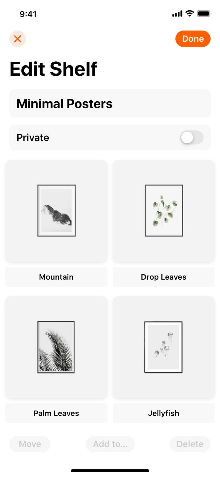
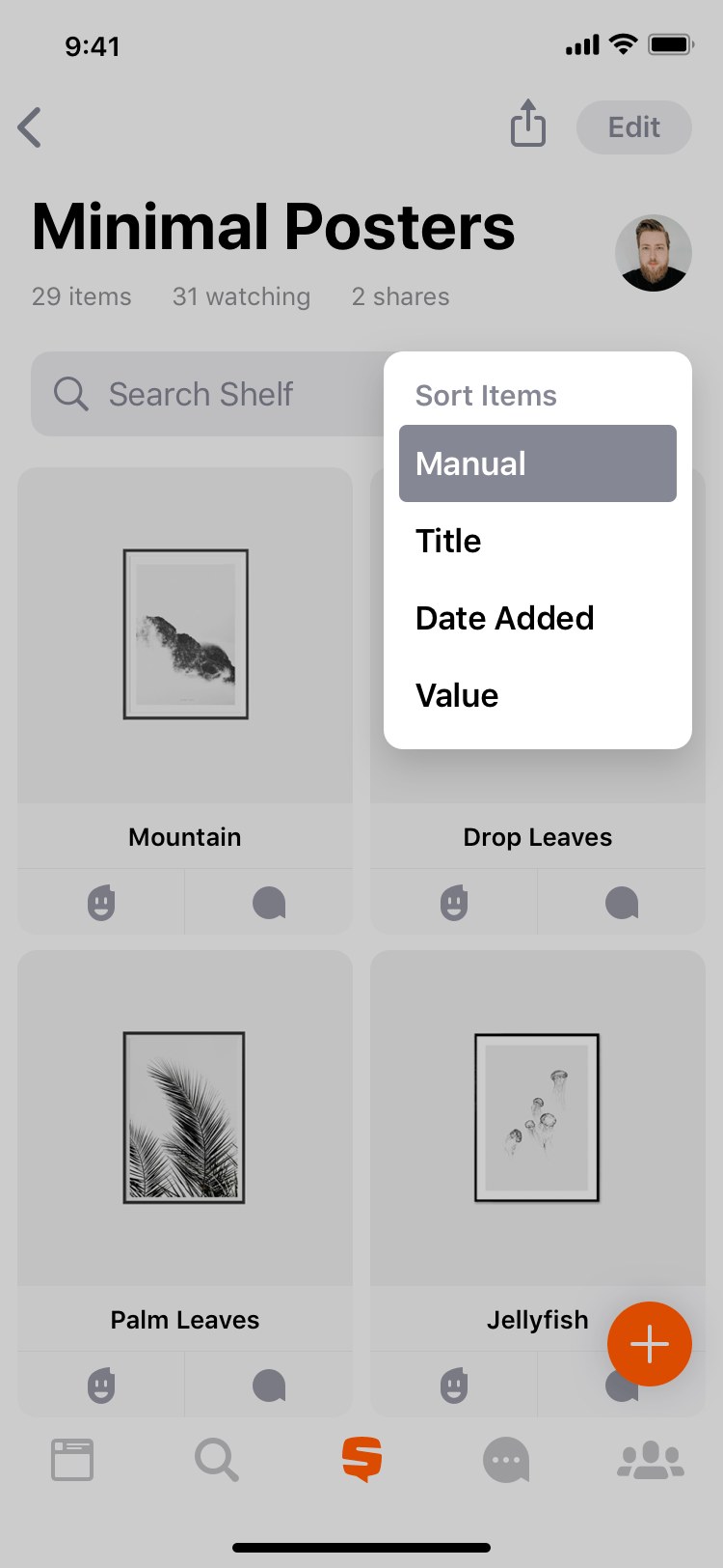
The fun doesn’t stop there. People can move items around on the shelf to arrange their shelf any way they like or select an automatic sorting to see items sorted alphabetically, chronologically or based on value. If there’s thousands of items on a shelf, people can easily find what they are looking for with search. It’s easy to edit shelf details and privacy control is incredibly transparent - the shelf is either hidden to everyone by default or public for everyone to see. It’s also easy to share and export shelves to many universal formats - e.g. if you need to share your item with an insurance company, the PDF or CSV export is a few taps away.
When working on the organizer feature set, we’ve paid close attention to quantitative analytics, listened closely to the feedback of our consumers, collected and quantified feature requests and prioritized based on demand, value to the consumer as well as the overall business value and cost. We went through multiple stages of prototyping, testing, building, polishing and iterating with each individual feature to make sure our consumers truly love the product.
Nurturing Communities
After the launch of a private organizer and learning from our first consumers, the original vision evolved into a social platform. We wanted anyone to seamlessly connect around their collections - whenever privately with close friends, or publicly with like-minded people around the world. It was a natural move but the challenge on hand was building a complimenting feature rather than cannibalizing the core value proposition and becoming just another social network.
Profile
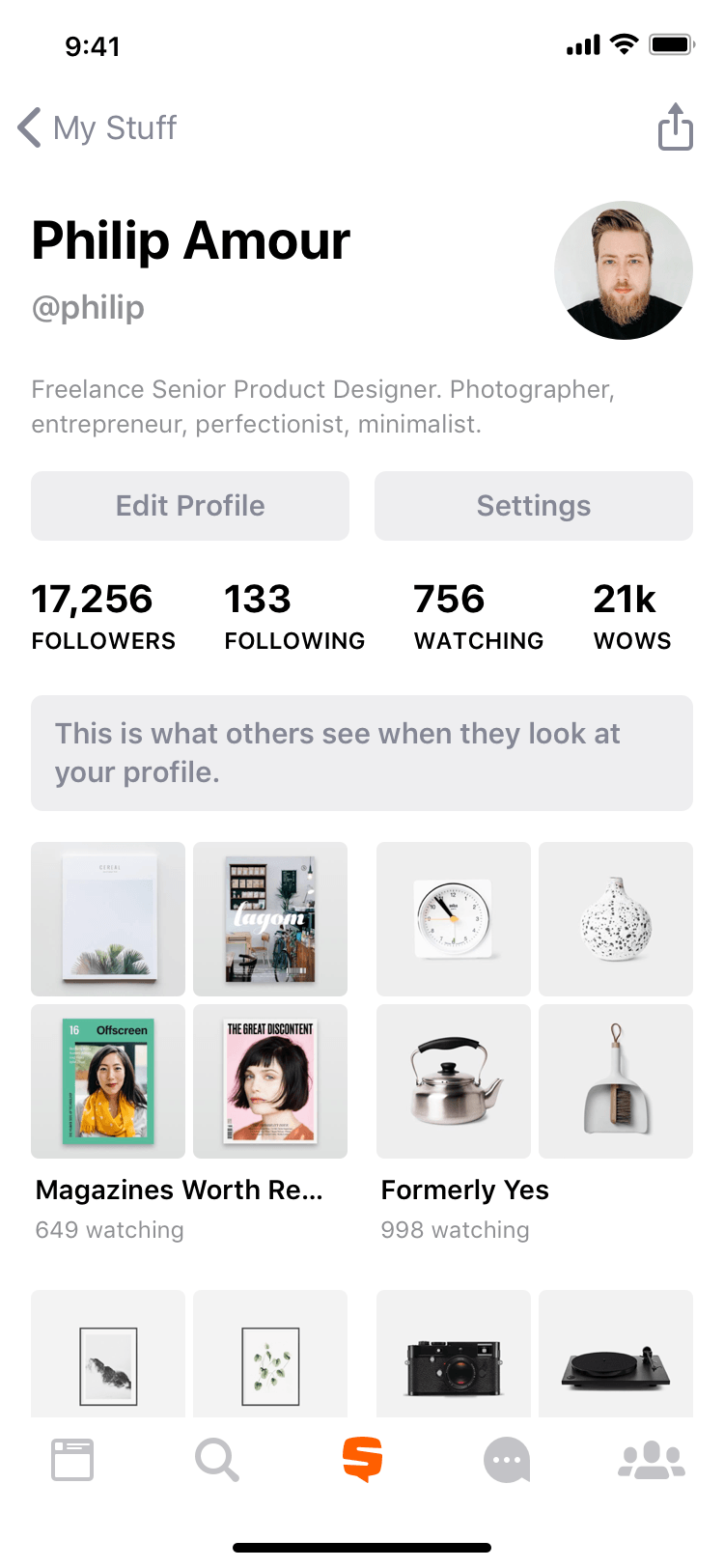
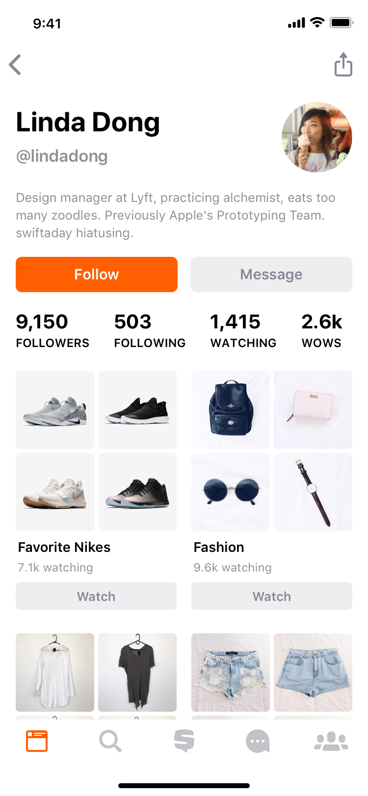
Sharing interests, passions and moments We wanted to give the customer opportunity to share, express themselves and take a control of what others see when they look at their profile. Initially we took this too far by making the profile both the place where people add and organize their stuff as well as place where they go to see the representation of who they are on Snupps.
People really enjoyed sharing and discovering others with similar interests as them but unfortunately we've unexpectedly put pressure on collectors who were conscious about their collections and weren't too keen on putting their stuff out in public. Even tho the consumer had a full control over what only they see and what's publicly visible to others, the first impression for them was that Snupps was mainly a social network and were discouraged from adding their belongings on the platform.
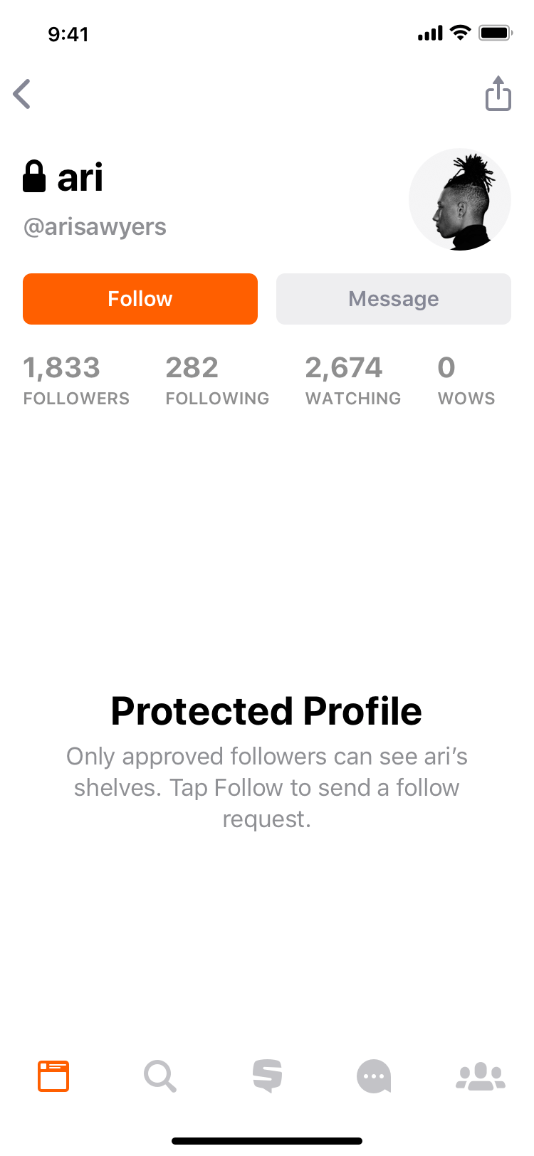
Back to the drawing board. After speaking to our existing customers and going through quantitative analytics, we've discovered that we have multiple needs and problems that we needed to solve. After narrowing down the possible solutions, we developed protected profiles that allow people from hidings all of the most personal details from their profiles to public and handpick only the people they trust to follow them. In addition, we've kicked off a revamp of various information architecture updates that now provide more focused organizing experience and clearly defines what others see when they look at the consumer's profile.
This was a journey of evolution. There were many variations of how profile looked and worked but after the changes mentioned above, we managed to satisfy both the social user as well as the private collector. Engagement increased and the number of items created by both groups grew.
Feed
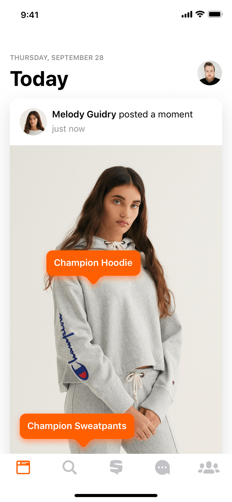
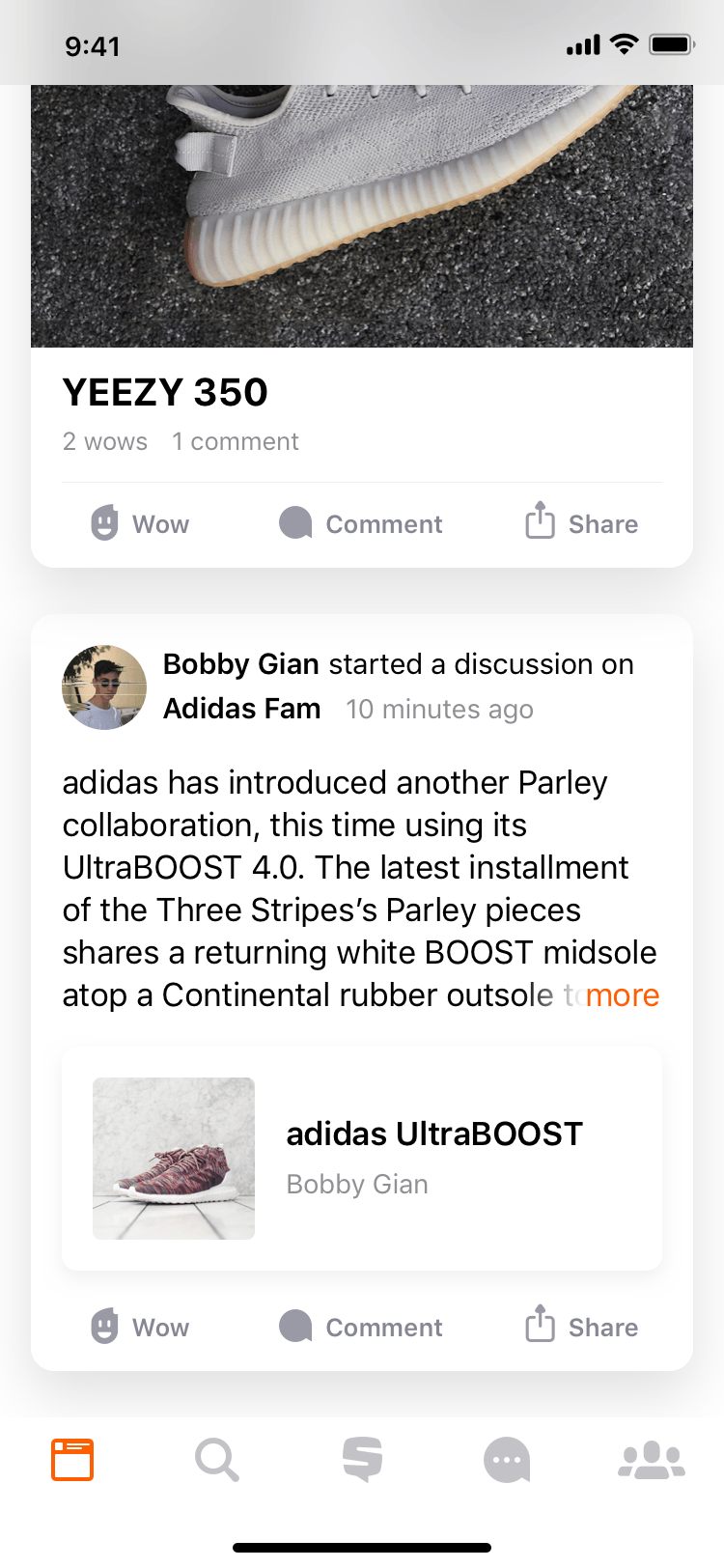
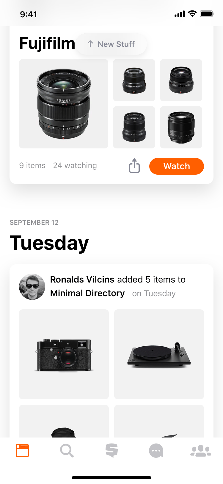
Keeping up to date with people and communities that matter. Snupps customers love seeing when the people they are interested in add something new or share a moment where they tag their stuff. What seems like a simple solution - time-line of events from people the user is following and updates on groups - was researched, analyzed, tested and iterated on heavily to suit the needs of our consumers and give them full control in order to provide the best experience possible.
All feed events are sorted in chronological fashion so that the consumer can see what's the latest and catch up on what they have missed. They only see new content from people they explicitly follow and from groups that are important enough for them to see in the main feed. The consumer sees exactly what they want. We've learned that in this case pushing recommendations and sorting main feed by popularity of the content doesn't increase engagement and retention but hurts the end-user experience. For recommendations and trending, we have an explicit areas where people can discover new stuff they may like.
Sounds pretty simple but simple isn't easy. There are many rules in place that ensure the best user experience possible. Such as that when a hardcore collector adds multiple items at the same time, the customer's feed is not cluttered with many events which make it harder to get to content by other people they follow.
Interests
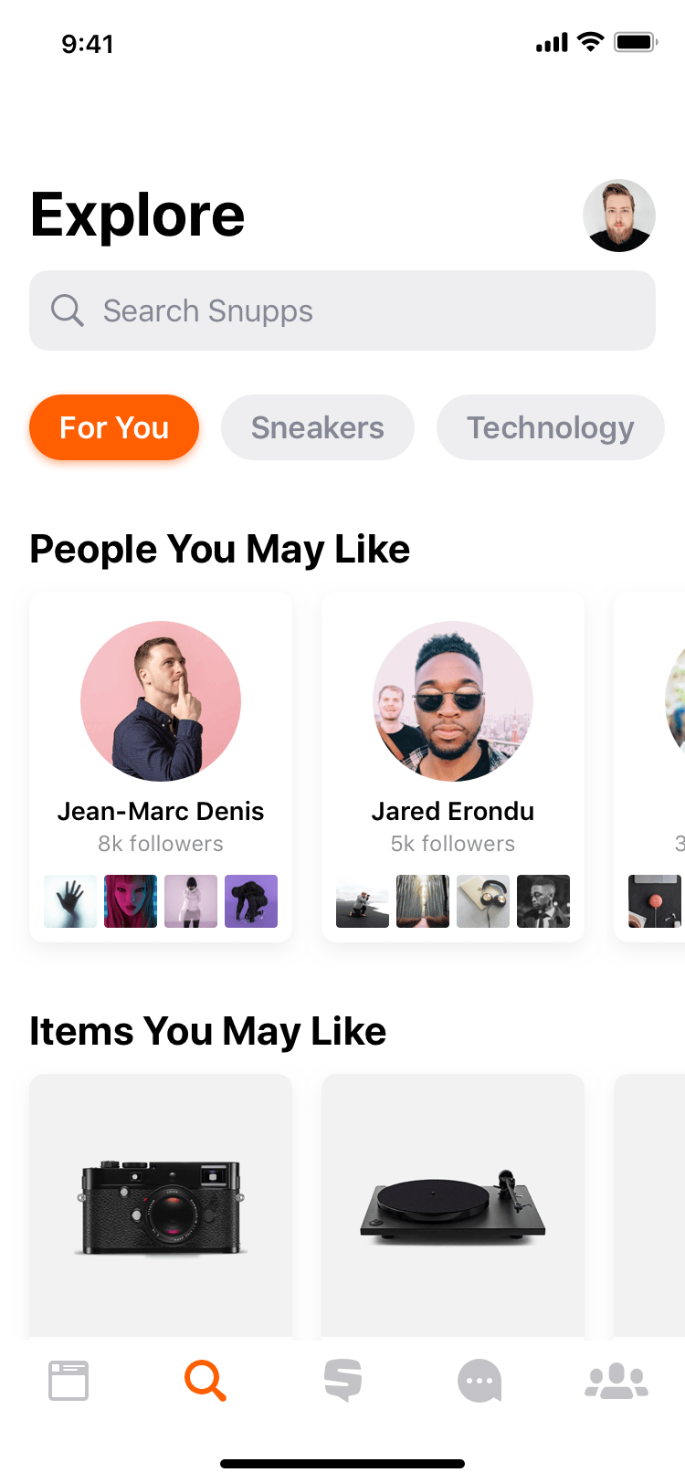
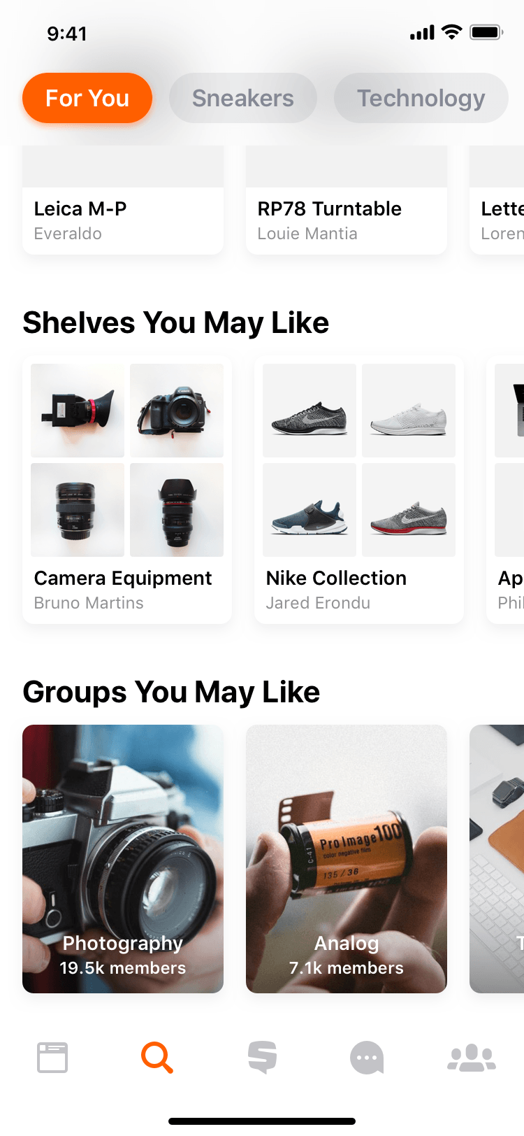
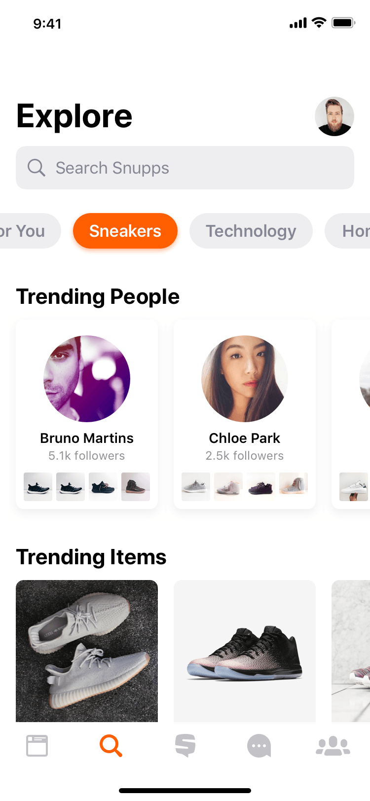
Content discovery re-imagined. As soon as a new customer signs up for Snupps, we ask them to select categories they are into to better cater the experience for them and recommend content they may like. We did an extensive analysis on current consumer base as well as market research to establish and narrow down on 23 categories of interests. Just enough to allow for variety but not too many to overwhelm the consumers. We keep a watch on emerging interests and communities that may benefit from Snupps to improve on our selection.
People can seamlessly browse their categories of interest on explore to discover new and trending collections, items, people, and more. After the initial launch, we've improved the feature even further, allowing people to discover content in many new ways; however, something didn't feel quite right. Our customers had to manually categorize their items and collections, there were some overlaps between categories and we've noticed an emerging trend where people took screenshots of their notes in order to share updates with people that were following the same interests. Extensive search revealed that there are many emerging specialized communities within each category, internal content moderation was getting harder with growth and more was needed for the communities to grow and flourish. So we made groups.
People can seamlessly browse their categories of interest on explore to discover new and trending collections, items, people, and more. After the initial launch, we've improved the feature even further, allowing people to discover content in many new ways; however, something didn't feel quite right. Our customers had to manually categorize their items and collections, there were some overlaps between categories and we've noticed an emerging trend where people took screenshots of their notes in order to share updates with people that were following the same interests. Extensive search revealed that there are many emerging specialized communities within each category, internal content moderation was getting harder with growth and more was needed for the communities to grow and flourish. So we made groups.
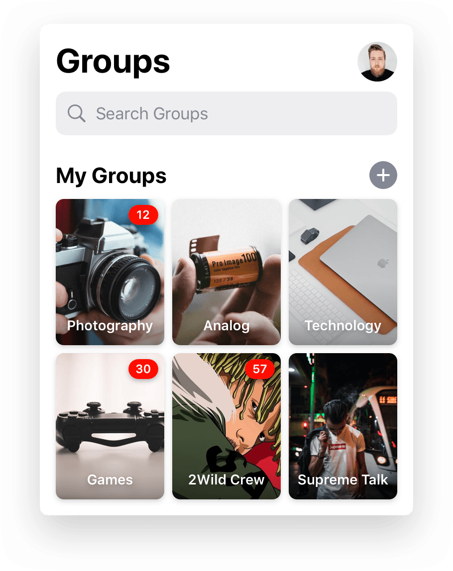
Groups
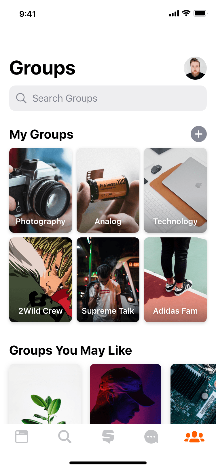
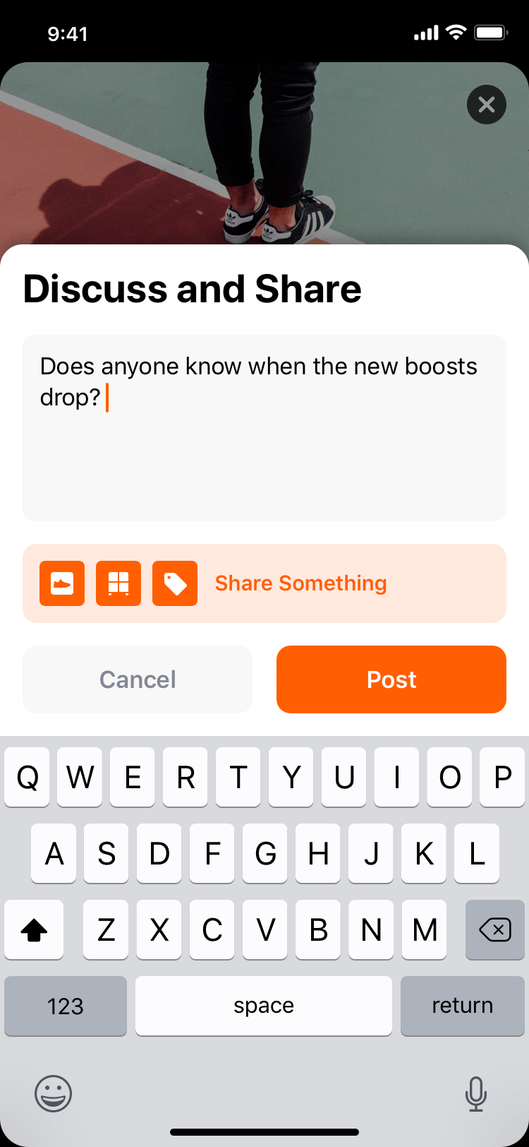
Enabling communities to thrive. Based on the learnings from Interests, we've had a clear set of requirements. People should be able to create groups for specific interests or purposes, easily control who can join, discuss relevant topics and moderate content. Many variations and multiple complimenting features were explored but we had to take a step back and think what's the most essential feature set that can efficiently address the problem, deliver great experience and be of a great value to the business whilst keeping technical constraints in mind.
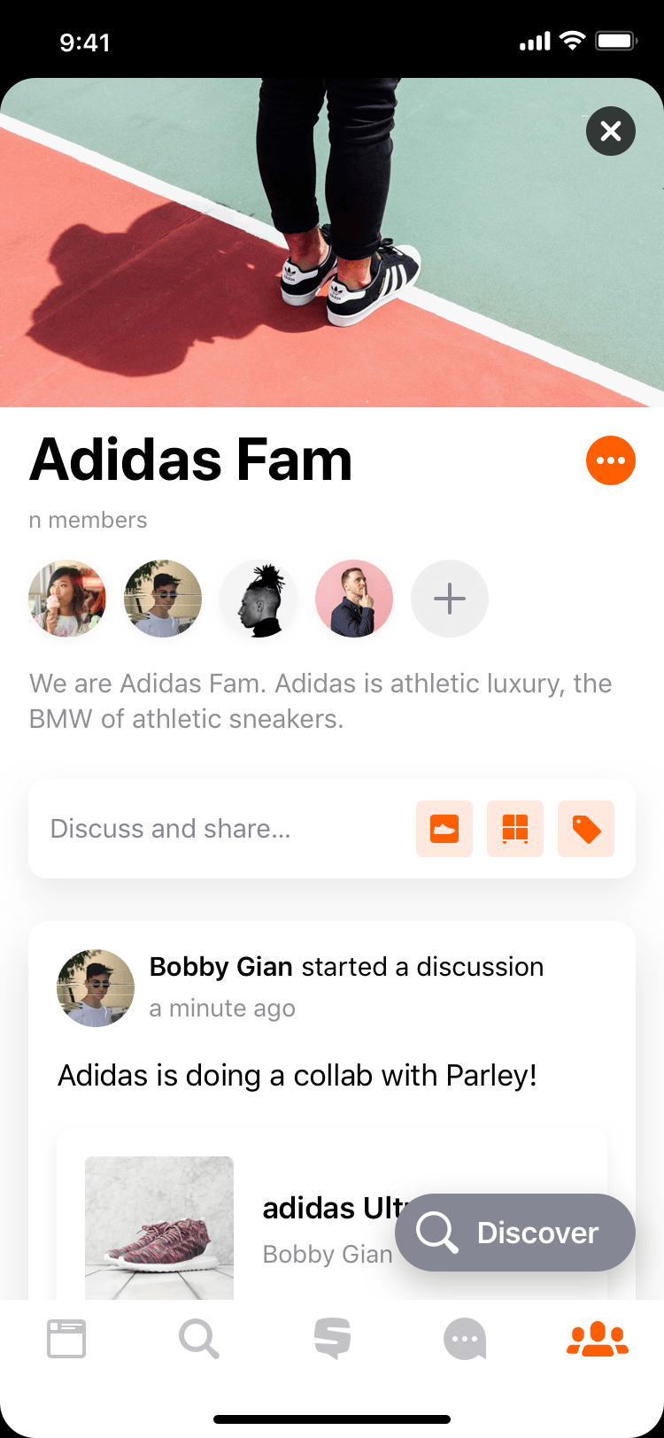
With this approach, we've identified that people should be able to discover groups, see which groups they are members of, view a group, see its purpose and members, share their content content on the group and start discussions. Of course moderation tools were required for the group admins to remove unwanted content and make sure the members are well behaved. Many influencers have shown interest in this feature, so we've partnered up and created groups for them so they can interact with their followers which fueled the launch of this feature. Feedback was great, retention rate and engagement increased. People really enjoyed the feature and all the new ways it allowed them to find people of the same interests and interact with them. The next natural step was to allow people to create their own groups.
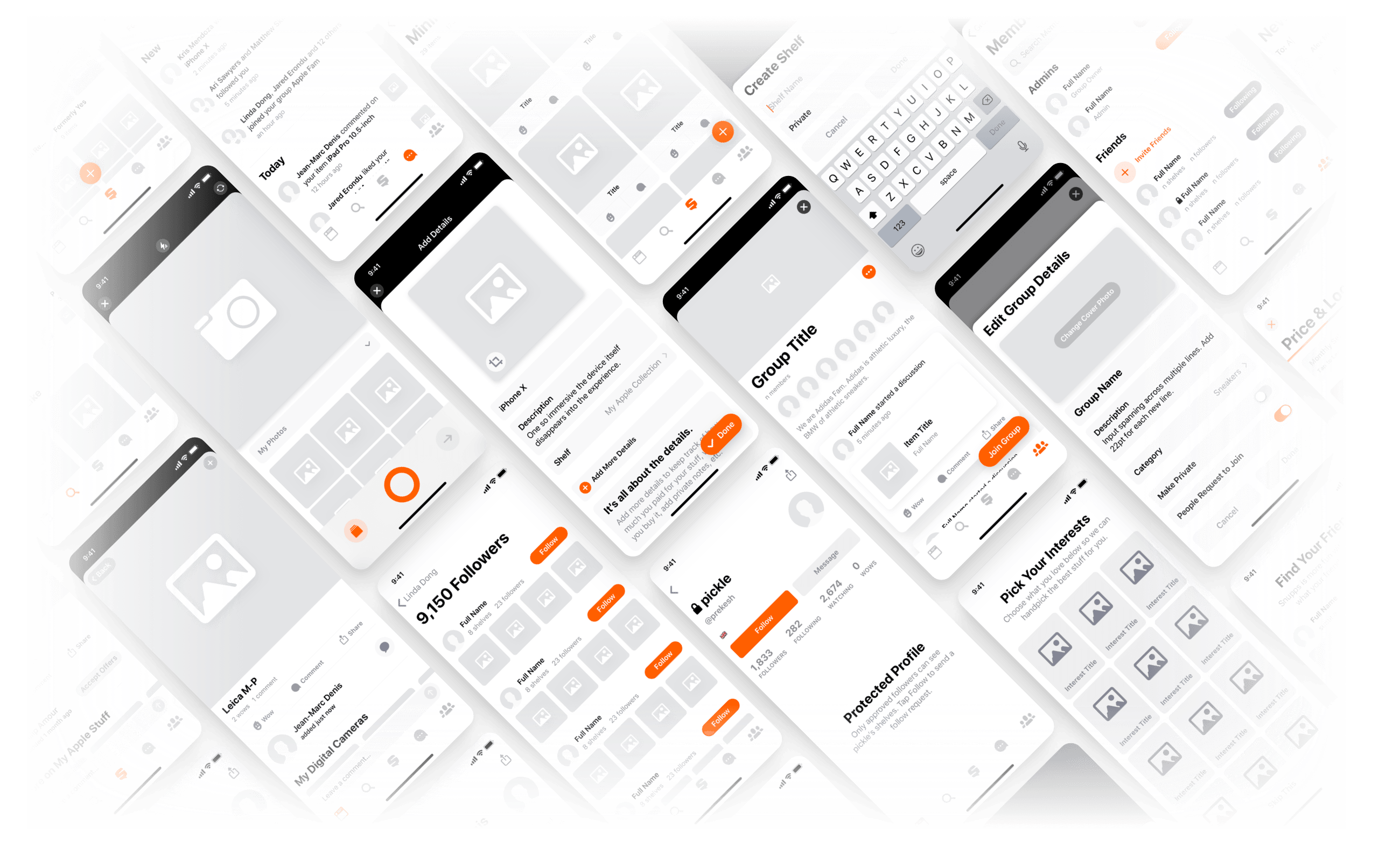
Creating groups should be easy and straightforward. It was essential to narrow down the group creation process so that people can create their own group based on their needs and focus on sharing and growing their community. After a thorough research and many iterations, we've ended up with a 3-step process where people fill in group details and set group privacy, then select an interest category and finally invite people to become members of the group. It's simple, efficient and privacy controls are clear - the group is either completely open and public, or protected - only approved members can join and post, or completely private and invite-only. After the release of this feature, we've seen the community grow and use Groups in ways we haven't predicted. For example we now have a community of maple trees enthusiast and a group of a private organization that uses the product for assignments and their internal workflows. We continue to improve on this feature and have many exciting ideas planned ahead.
Designing a Design System
Solid foundation. Consistent experience across iOS, Android and Web as well as the product itself. Frictionless and clear design specification for all. Source of truth. Easy to use library of components and styles for anyone to use and update.
Visual Language
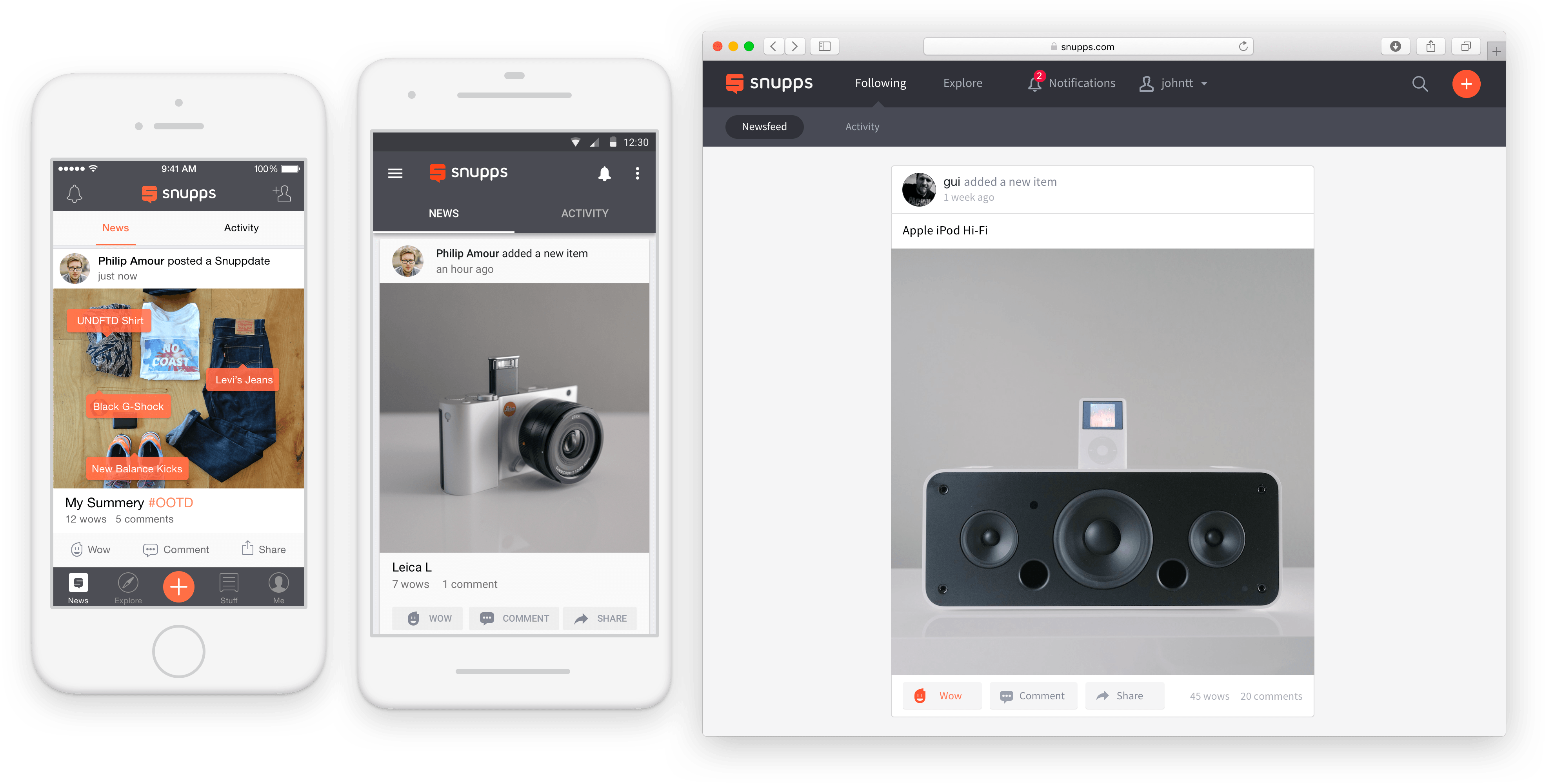
The initial approach was to use native (vanilla) components on iOS and Android in order to provide a familiar experience and reduce development cost. We injected brand colors in the interface and used a custom font to communicate the Snupps brand and had a separate treatment for the web. This proved to be an insanely laborious system to manage, we had different spec per each platform, time to design a feature across multiple platforms was too great and there were many consistencies in the product. At the end of the day, even tho the intention was great, the process didn’t work out for the team and the end user experience was not great.
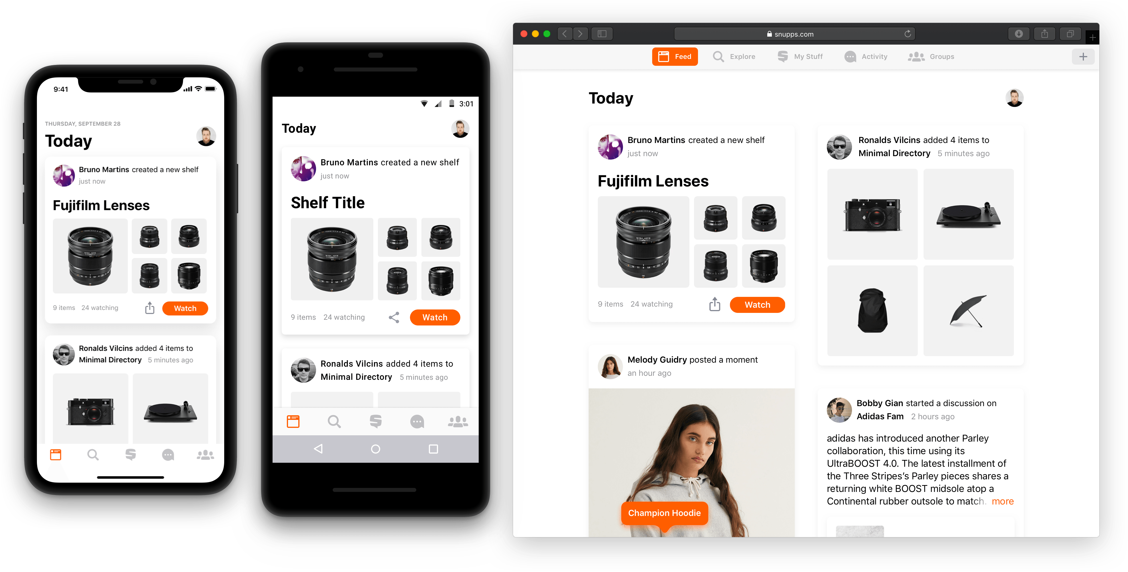
We needed a system that would allow us to introduce cross-platform Snupps-specific components that would feel like they belong on every platform and extend the Snupps brand. On the other hand some controls, bars and views unique to a particular platform were not changed in order to provide a native experience to the user that they were used to. For example, we were using a native UINavigationBar on iOS, App Bar on Android and a custom navBar on the web. System fonts were used on iOS and Android and for Web we picked Roboto to avoid UI inconsistencies if a system font was used on macOS, Windows, Ubuntu, etc. Snupps-specific views such a Profile View and Shelf View was mostly custom and had the exact same look and layout on both iOS and Android.
This approach helped unify workflows for all platforms, ensured a consistent experience across all the platforms and after initial technical investment to build some of the custom components, the time to develop new features reduced drastically. Based on our learnings, the philosophy moving forward is - be consistent with product-specific UI if possible and use platform’s native components unless you can provide a significantly better user experience. Unfortunately a lot of companies get the idea of consistency wrong and work on consistent UI for the sake of maintaining a single code base, not to provide a consistent user experience across platforms and build a lot of low fidelity custom components to replace system controls, in result providing inferior experience compared to what could be if they just used system components or build replacements that were as good or better than the native components.
Before Redesign
Move Cursor Here to See Redesign
After Redesign
Move Cursor Away to See Original Designs
Styles
Unifying styles across multiple platforms can be a challenge but we made this as simple as possible by coming up with a dictionary that both engineers and designers can understand and follow. Our approach had to cater for changes in style value and take in account the possibility of supporting multiple themes (e.g. light theme and dark theme) so the naming had to be not just consistent and understandable but focus on a purpose of a specific style, rather than its looks.
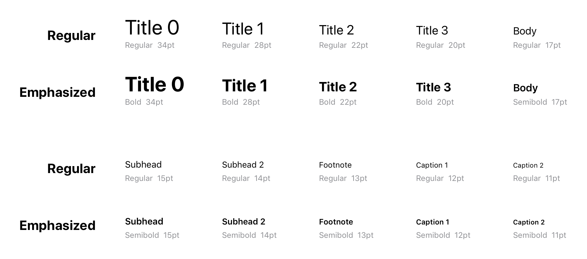
Text styles were named so that they described their general use and would work across all platforms. Not just that, we catered for the support dynamic type down the line. Naming and definitions were inspired by Apple’s iOS Text Styles but had a couple of additions to cater for specific needs of the product. The beauty of this is that naming and use of a particular style can be consistent across all platforms even tho different platforms may have a different value for a particular style.
Text styles were named so that they described their general use and would work across all platforms. Not just that, we catered for the support dynamic type down the line. Naming and definitions were inspired by Apple’s iOS Text Styles but had a couple of additions to cater for specific needs of the product. The beauty of this is that naming and use of a particular style can be consistent across all platforms even tho different platforms may have a different value for a particular style.
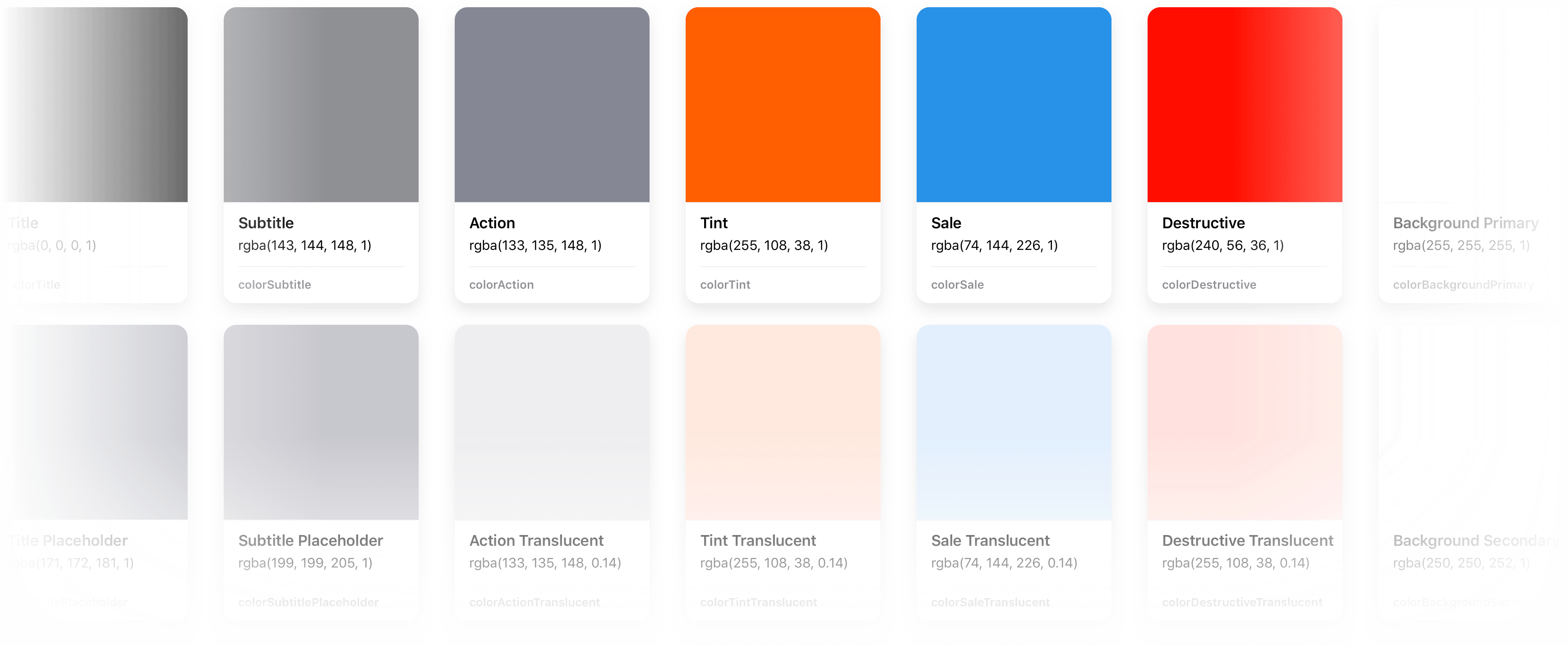
Color naming is purposeful and based on how a particular color is used in the interface. It’s incredibly easy to understand and consistent across all platforms. Not only that, as a result the interface can support multiple themes as color names don’t describe their value.
Components
Long gone are days when mocking up a couple of screens in Photoshop and handing over to dev was a common practice. User interfaces are not static mockups, they live and breathe through their lifecycles. Each individual element can have multiple different states and variations. User interface elements get reused in many places and there needs to be a single source of truth, otherwise we end up with inconsistencies and a lot of additional work. So we built a Snupps design library to address this problem. It is largely based on my personal Editorial Design System that contains iOS system component but is optimized for accuracy and ease of use so anyone can quickly mock up a high-fidelity interface in no time. It can be easily extended with a product-specific components and that’s what we did.
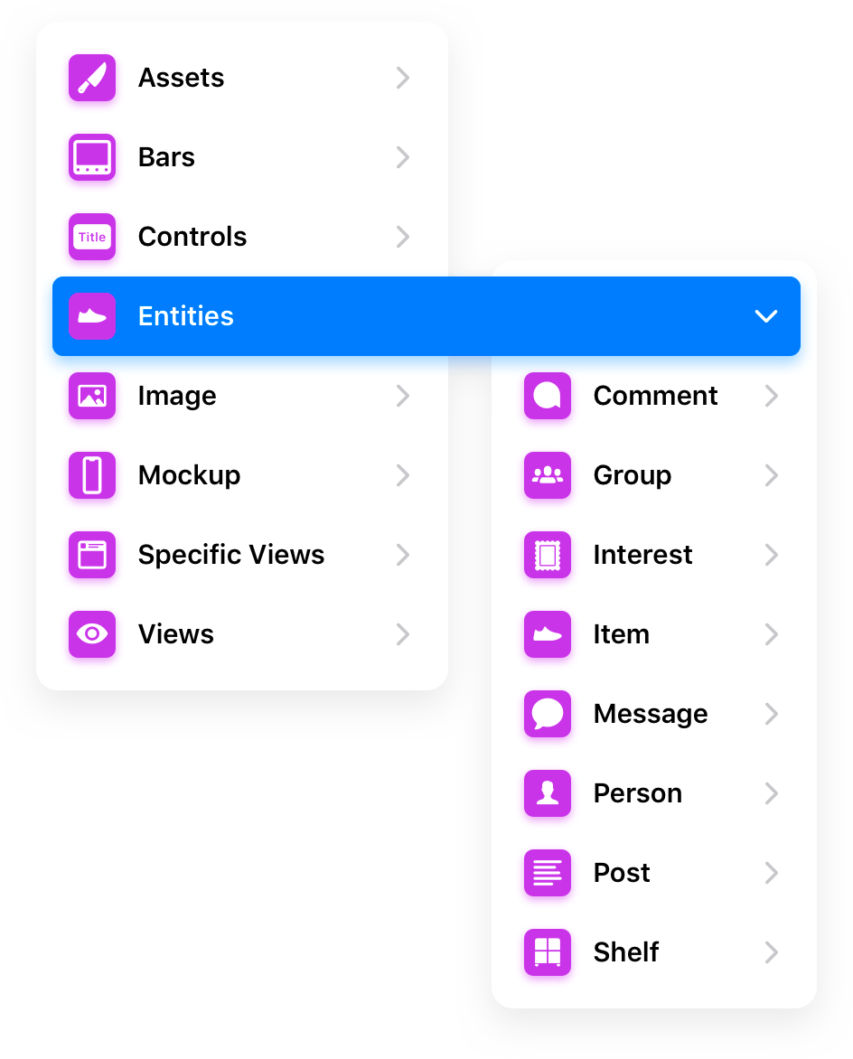
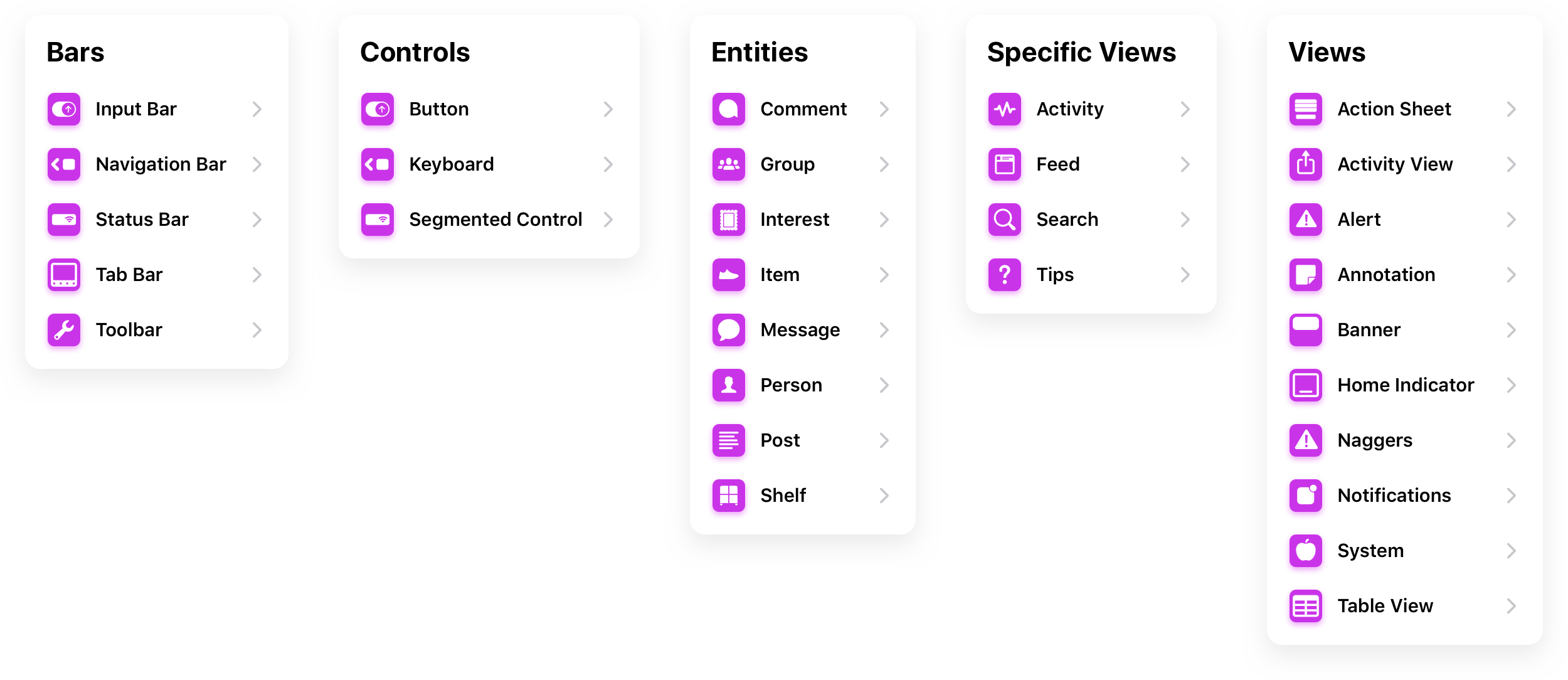
The component system is divided in multiple parts:
Assets - product-specific elements that are reused through the UI and are exported for dev to use when implementing the UI.
Bars - system and product-specific components that appear above or within views
Controls - components used to control the interface
Entities - product-specific entities
Image - profile pictures, photos of items, etc. to be used for wireframing or creating a realistic mockups
Mockup - sometimes a screen needs to be overlaid and reused throughout the UI so instead of duplicating it and making it harder to change things down the line, it becomes a component for purely design purposes
Specific Views - components for product-specific views
Views - system-specific components such as Table View, Action Sheet, Alert, etc.
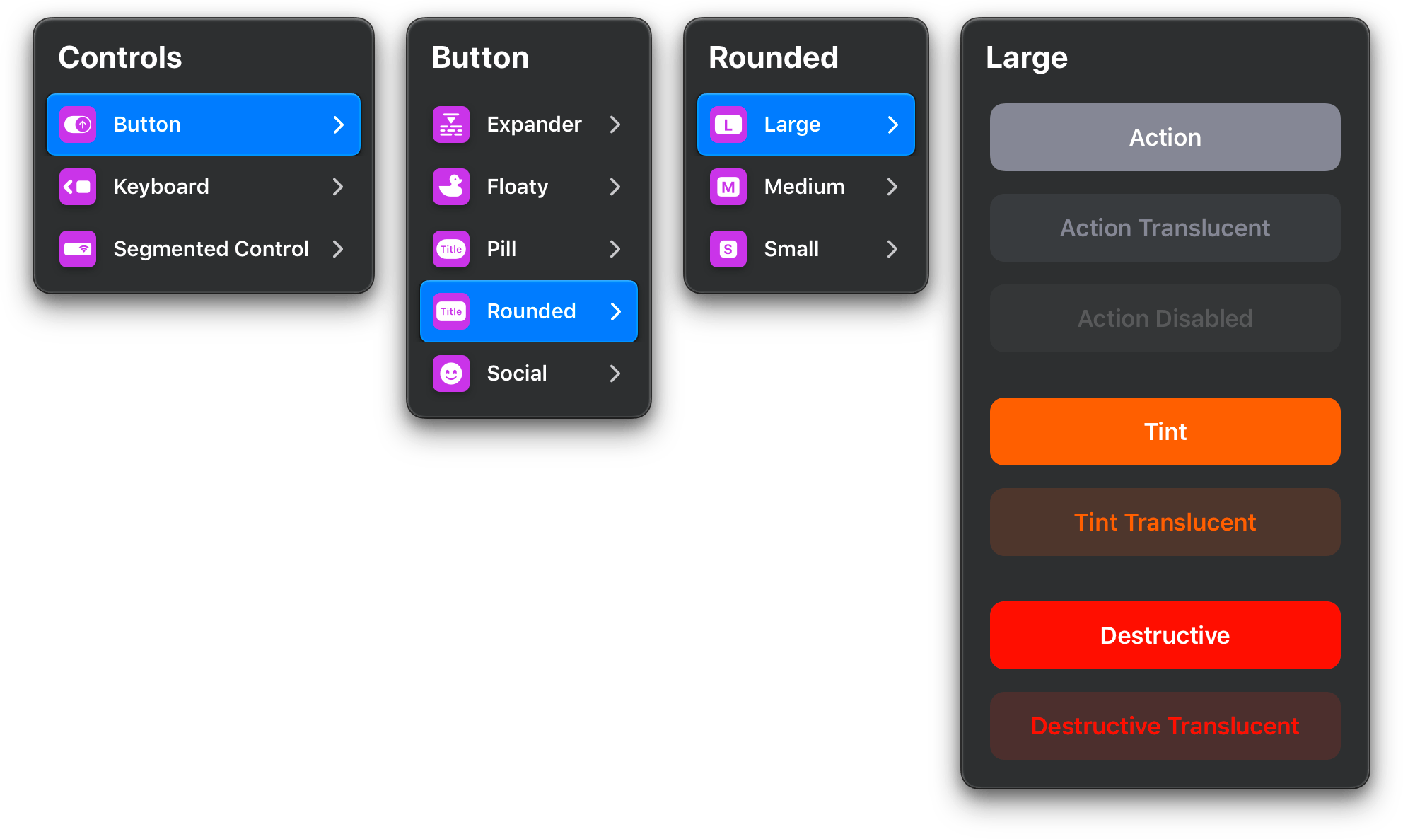
Each component can have 3 or more sections, for example:
Template - most common variation(s) of a component that can be customized
Builder - components that are reused in a particular component template to form a component
Accessory - additional overrides for the builder - such as icons
Every single part of the component library is meticulously organized. Title case naming that makes for a consistent and pleasant experience throughout. Clear hierarchy in layers panel that makes the structure of a component clear and obvious to both engineers and designers. Every applicable layer is assigned to a style which makes implementation a breeze. Overrides can have a few names from the overrides dictionary which include emojis so they are easy to spot and distinguish. It also makes for a consistent experience when working with the spec.
States
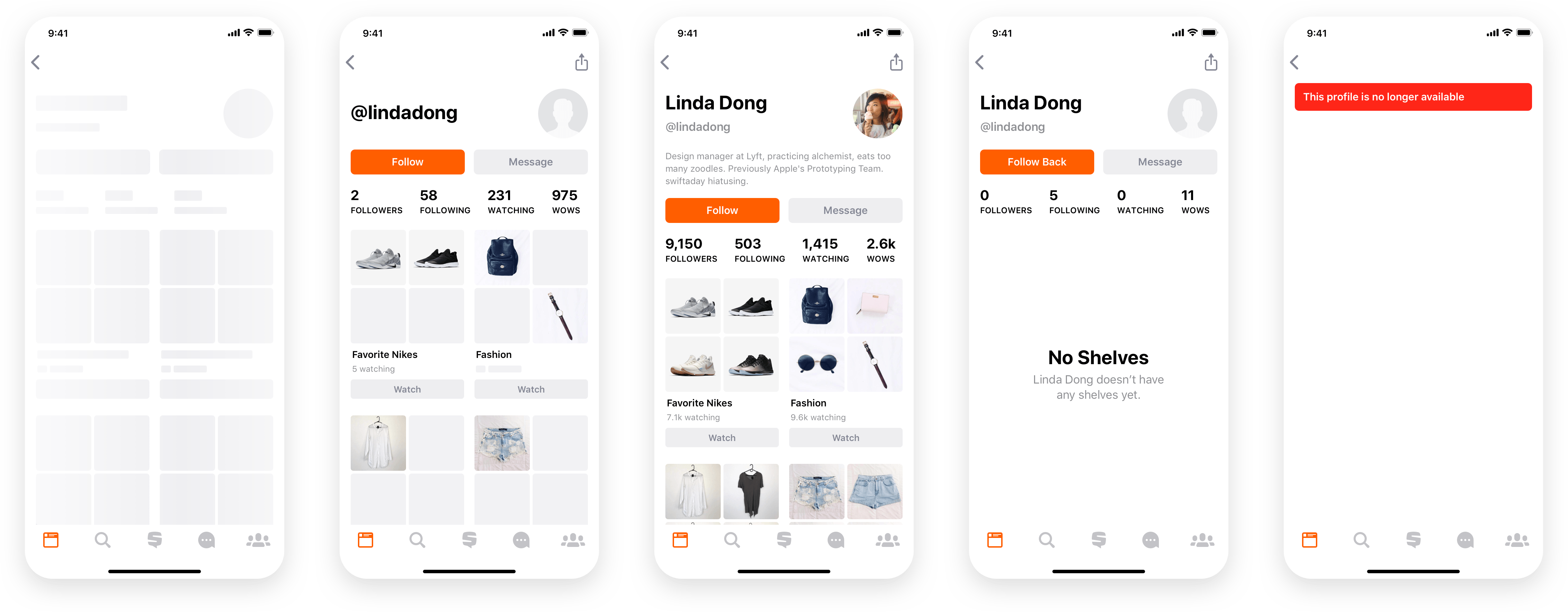
Designing how a product looks and behaves is not mocking up a single screen in its ideal state and posting it on social media. To provide a high quality user experience, the product needs to be thought out and as much of the interface as possible needs to be designed and specified. If it’s not specified, it still needs to be catered for and build by dev and in a lot of cases, a quick and dirty solution that may not be the best for the user will be implemented. A non-negligible part of the design process is thinking through the lifecycle of each screen and specify what happens and how does the UI look like in non-ideal states. I can’t stress enough how important this is but unfortunately many design teams neglect this part of the design process.
Servers can take time to respond, things can go wrong and the user shouldn’t be left stranded with no help whatsoever. That’s why whenever we can we design multiple UI states, for example:
Happy State - the most common state, this is what people see when things go as expected
Loading State - the customer is waiting for content to load
Partial State - some of the content has loaded, some has not
Empty State - this is one of the most neglected states even tho it brings one of the biggest opportunities to help the customer and explain what’s going, why there is no content and what can they do to fix it
Error State - the most neglected state of the UI by designers! This is when things go wrong and there can be confusion and anxiety caused to the customer. We need to indicate what happened, assure the customer and help them fix the issue.
Catering for non-ideal states results in much better product and far greater experience for the end-user as well as everyone involved in developing the product.
Organized for Success
Initially, we had a sketch file per feature which proved to be inefficient and resulted in inconsistencies and additional work. Later we switched to one sketch file per app area / entity, which improved the workflow but due to the size of our team was still inefficient. Learning from previous mistakes and figuring out how to improve performance of sketch documents, we’ve changed our approach to be a single sketch file per each platform. Efficiency went through the roof and everyone on the team found it incredibly easy to find spec for whatever they were working on.
A couple of things happened since then - Sketch team added support for external Libraries and finally supports shared styles in libraries. If our design team was bigger, it would definitively make sense to split up components and styles into libraries and then perhaps split up the master sketch spec by entity and app area so that multiple people can work at different things on the same platform (or across platforms) at the same time. Version control via Abstract or similar and team is set for success. However, with the limited resources and small design team, a single master spec per platform (they are around 6 MB each!), this is an ideal solution for this particular team and its current state.
The sketch master is currently split into following areas so that it’s easy to browse through and find things:
Welcome - This section has QuickLook preview (to make the file size as small as possible but provide context in Finder) and Get Started page for new employees that gives them a quick overview of the spec and how to work with it.
Root Views - topmost areas of the app, accessible with the main Tab Bar navigation
Item - viewing, creating, editing, buying and selling a Snupps 'Item'
Shelf - viewing, creating and editing a Snupps ’Shelf’
Profile - variations of the Snupps ‘Profile’
Group - viewing, searching, creating, joining and editing Snupps ‘Group’
Discussion - viewing and starting a Snupps ’Discussion’
Message - viewing and composing messages as well as transactional messages
Share - variations of ‘Share’ and ‘Shared’ view
Onboarding - all the steps of initial onboarding ranging from the landing screen to first time user experience
Various - different specific views that don’t fit above
Extensions - app extensions such as push notifications
iPad - iPad Specific UI
WIP - secret work in progress projects
Exports - organized slices of icons and other assets to be exported for development
Visual Design - text styles, colors and images
Components - the holy grail of the spec where the component library lives
